
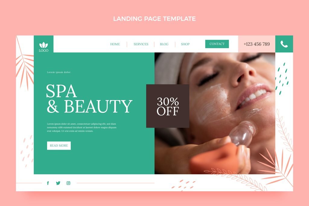
Most med spas offer more services than a simple business does — injectables, skin treatments, laser, body contouring, wellness services, sometimes retail products — which creates a real navigation challenge. Cram everything into the main menu and it becomes overwhelming. Oversimplify it and patients can’t find what they’re actually looking for. Getting this wrong doesn’t just look messy — it directly costs bookings, because a visitor who can’t quickly find their treatment of interest often leaves rather than digs.
Here’s how to think through navigation specifically for a multi-service med spa, beyond the general “keep it simple” advice.
The Core Tension: Breadth vs. Simplicity
A med spa offering ten or more distinct services faces a real structural choice. List every single service in the main navigation, and the menu becomes a wall of text that’s hard to scan, especially on mobile. Collapse everything into a few broad categories, and patients searching for something specific (like “lip filler” or “CoolSculpting”) may not immediately see where to click.
The solution most well-structured med spa sites land on is a two-level hierarchy: broad categories in the main navigation, with specific treatments nested underneath, visible through dropdowns or a dedicated overview page.
A Practical Navigation Framework
Top-level categories (in the main menu)
Group services into a small number of broad, intuitive categories — typically 4 to 6 — such as:
- Injectables
- Skin Treatments (facials, peels, microneedling)
- Laser & Light Treatments
- Body Contouring
- About / Providers
- Contact / Book Now
Second-level items (dropdowns or category pages)
Under each broad category, list the specific treatments. “Injectables” might expand to Botox, Dermal Filler, Lip Filler, and Sculptra, for example, as covered in more depth in our post on injectable-specific site structure. This keeps the main menu clean while still surfacing every individual treatment within one or two clicks.
Persistent, prominent booking access
Regardless of how the rest of the navigation is structured, a booking or “Book Now” link should remain visible and consistent across every page — typically in the top-right of the header — so a visitor who’s already decided to book doesn’t have to hunt for the path to do it, no matter where they are on the site.
Mobile Navigation Deserves Its Own Consideration
Since most visitors are likely browsing on mobile, the navigation needs to work well within a hamburger menu or mobile-specific pattern, not just be a shrunken version of the desktop menu. A few specific considerations:
- Keep top-level categories short and thumb-friendly — long dropdown lists are harder to scroll and tap accurately on a phone.
- Make the booking CTA persistently accessible on mobile, often as a sticky button, since mobile visitors are frequently browsing in a moment of decision (scrolling social media, then clicking through) and benefit from an always-visible next step.
- Avoid deeply nested mobile menus — more than two levels of tapping to reach a specific treatment page creates real friction on a small screen.
Secondary Navigation Elements Worth Considering
- A search function, particularly useful once your site has enough individual treatment pages that browsing alone becomes inefficient for a visitor with something specific in mind.
- Breadcrumbs on treatment pages (Home > Injectables > Lip Filler), which help visitors understand where they are within the site structure and make it easy to browse related treatments within the same category.
- A footer menu that duplicates key links (services, provider bios, contact, booking) for visitors who scroll to the bottom of a page rather than using the header navigation.
What Tends to Go Wrong
- An overloaded main menu listing every single service directly, without categorization — overwhelming, and hard to scan quickly.
- Vague category names that don’t clearly communicate what’s inside them (e.g., “Services” as a single catch-all, rather than specific categories a patient can recognize at a glance).
- Inconsistent navigation between desktop and mobile — if the mobile menu is structured completely differently from desktop, patients moving between devices (common during multi-session research) experience a confusing, seemingly different site.
- Burying the booking CTA inside the navigation rather than making it a persistently visible, separate element — this is a common and costly mistake, since booking access should never require a visitor to think about where to click.
A Simple Test for Your Current Navigation
Pick three of your specific services and time how long it takes a first-time visitor (or better, an actual friend unfamiliar with your site) to find each one from your homepage. If any of them take more than two clicks or noticeable searching, that’s a sign your navigation structure needs adjusting — either by better categorization, clearer labeling, or reducing how deep specific treatments are buried.
The Underlying Principle
Navigation is one of the least visually exciting parts of a website, but it’s one of the most functionally important — it’s the structure that determines whether a motivated visitor can actually find and act on what they came for. For a multi-service med spa specifically, a clear two-level hierarchy, consistent mobile behavior, and a persistently visible booking path solve most of the real navigation problems without requiring an overly complex menu system.
Not sure if your current navigation is helping or costing you bookings? [Book a free website audit] and we’ll map out exactly where visitors are getting stuck.

