
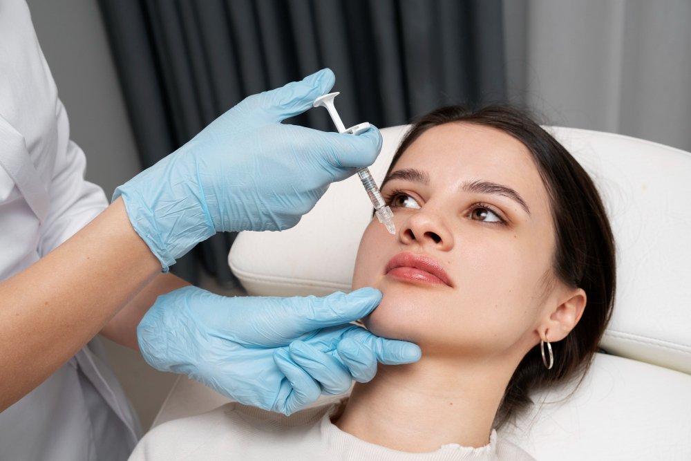
Injectable practices face a structural challenge most other clinic types don’t deal with in quite the same way: you’re often offering several distinct-but-related treatments — Botox, dermal fillers, biostimulators like Sculptra, lip filler, jawline contouring — that patients frequently confuse with each other, search for differently, and evaluate somewhat differently before booking.
Get the layout wrong, and you end up with either a bloated, confusing navigation menu or a single overloaded “Injectables” page that fails to properly serve any specific treatment. Here’s how to structure a site that handles this well.
The Core Structural Decision: One Page or Many?
The biggest architectural choice for an injectable-focused practice is whether each treatment gets its own dedicated page, or whether treatments are grouped under a single broader page.
Individual pages per treatment (Botox, Filler, Sculptra, etc.) generally work better, for two connected reasons:
- Search behavior is specific. Patients searching “Botox near me” and patients searching “lip filler consultation” have different intents, different concerns, and often different price sensitivity. A single generic “Injectables” page can’t speak precisely to either.
- Decision-making is specific. A patient considering Botox for the first time has different questions (Does it look natural? How long does it last?) than someone considering a biostimulator like Sculptra (How many sessions? How gradual are results?). Dedicated pages let you answer the actual question each visitor has, rather than generic information that half-applies to everyone.
The tradeoff is more pages to build and maintain — but for a growing injectable practice, this structure supports both patient experience and long-term SEO far better than a single crowded page.
Recommended Site Structure
A layout that tends to work well for injectable-focused practices:
- Homepage — broad positioning, top services, one clear primary CTA, trust signals (as covered in other pieces on this blog).
- Injectables overview page (optional but useful) — a brief hub page listing each specific treatment with a short description and a link to its dedicated page. This helps visitors who aren’t sure exactly what they want yet, and helps search engines understand your site’s topic structure.
- Individual treatment pages — one each for Botox, dermal filler (potentially split further into lip filler, cheek filler, jawline filler if these are significant service lines), biostimulators, and any other distinct injectable offering. Each page should include: what it is, what it treats, the process, recovery/downtime, realistic expectations, relevant before-and-afters, provider information, and a clear booking CTA.
- Provider pages — linked from every treatment page, since patients evaluating injectables are highly focused on who’s actually performing the treatment.
- Before-and-after gallery — organized by treatment (as covered in a related post), linked from each relevant treatment page.
- FAQ section — either per-treatment or consolidated, addressing common concerns (pain, downtime, cost range, how soon results appear).
Navigation: Keep It Shallow
Even with several individual treatment pages, navigation shouldn’t feel deep or complicated. A dropdown under “Injectables” in the main menu, listing each specific treatment, keeps everything one click away without cluttering the primary navigation bar. Avoid nested sub-menus beyond this level — if a patient has to click through three menu layers to find Botox pricing, that’s friction working against you.
Content Layout Within Each Treatment Page
For each individual treatment page, a layout that tends to convert well follows a logical patient decision-making order:
- What it is and what it addresses (brief, scannable, near the top)
- What to expect (process, sessions, downtime)
- Real results (before-and-afters specific to that treatment)
- Who performs it (linked provider credentials)
- Common questions (FAQ, ideally as an accordion to keep the page from feeling long)
- Clear booking CTA, repeated near the top and again at the end
This mirrors the “minimal structure, layered depth” principle covered elsewhere on this blog — clean and scannable at first glance, with real depth available for a visitor who wants it before booking.
A Common Mistake: Treatment Pages That All Look Identical in Substance
It’s tempting, once one treatment page template is built, to duplicate it with minor swaps for every other treatment. Patients (and search engines) notice when pages feel templated rather than genuinely specific — nearly identical FAQ sections, recovery information, and before-and-afters copy-pasted across different treatments read as low-effort, and can also create duplicate-content issues that hurt SEO across all the pages involved.
Each treatment page should reflect genuinely specific information for that treatment — different concerns, different recovery realities, different before-and-after examples — even while following the same overall structural template.
The Underlying Principle
For an injectable-focused practice, layout isn’t just a visual design decision — it’s an information architecture decision. Patients searching for a specific treatment want a specific, well-organized answer, not a generic overview page that requires them to sort out relevant details themselves. Structuring your site around individual, well-built treatment pages — connected by shallow, clear navigation — serves both the patient experience and your long-term search visibility at the same time.
Not sure if your current site structure is set up to convert injectable-specific searches? [Book a free website audit] and we’ll show you exactly where structure is costing you visibility or bookings.

