Your homepage is your digital front door. For a prospective patient, it’s often the first step in a high-stakes journey of trust. You have mere seconds to make them feel confident they’ve found the right clinic. But a great homepage does more than just look professional; it works tirelessly to turn curious visitors into booked consultations. The secret isn’t about cramming in more features. It’s about clarity, credibility, and a seamless patient journey.
Learning how to create a simple homepage that converts is one of the most valuable skills for any clinic owner. The key is to grab attention with a clear value proposition, build unshakeable trust with patient-focused social proof, and guide users toward one goal: booking a consultation. This guide breaks down the essential elements you need to build a homepage that not only welcomes potential patients but also drives real growth for your clinic.
Nail the First Five Seconds
When a visitor lands on your site, they make a snap judgment. Research shows users form an opinion about your website’s design in just 50 milliseconds. You have to communicate expertise and safety instantly.
Start with a Powerful Hero Section
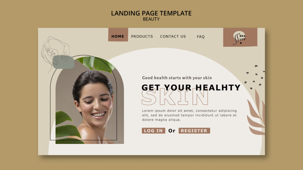
The hero section is the large, prominent area at the top of your homepage. It’s your single best opportunity to convey your clinic’s quality and focus. This space should contain a high-resolution image of your pristine clinic interior or a professional photo of your lead practitioner, a compelling headline, and a clear call to action. Because users spend about 57% of their time above the fold, your hero section has to do the heavy lifting.
State Your Value Proposition Immediately
Within that hero section, you must present a clear value proposition. This is a concise statement that answers three questions for a potential patient:
- What treatments do you specialise in?
- Who are these treatments for?
- Why should they trust you with their face and body?
A strong value proposition hooks them and encourages them to explore further. For example: “Medically-Led Aesthetic Treatments in London | Achieve Natural-Looking Results with Our Expert Team of Doctors.”
Use a Simple Layout and Clear Visual Hierarchy
A cluttered homepage feels unprofessional and erodes trust. A simple layout with plenty of white space helps patients focus on what’s important: your expertise and the results you deliver. Simplicity feels clinical, calm, and premium. It makes your message clearer and your calls to action stand out. In fact, 38% of people will stop engaging with a website if the layout is unattractive or cluttered.
This is where visual hierarchy comes in. It’s the art of arranging elements to show their order of importance. Your value proposition should be the largest, most prominent text. Your primary “Book a Consultation” button should use a contrasting, on-brand colour to draw the eye. A good hierarchy means that even if someone just scans the page, they will understand your specialty and how to take the next step.
Build Unshakeable Trust from the First Click
Before a patient will share their personal details or book a consultation, they need to trust you completely. A professional design is the first step, but you must reinforce that trust with undeniable signals of medical credibility.
Display Obvious Trust Signals
Trust signals are elements on your site that make your clinic feel legitimate, safe, and regulated. For an aesthetic practice, these are non-negotiable:
- Practitioner credentials and registration numbers (e.g., GMC, NMC, AHPRA).
- Logos of professional bodies or regulatory authorities (e.g., CQC, Save Face).
- “As featured in” logos from reputable beauty or medical publications.
- A clear link to your privacy policy, demonstrating respect for patient data.
- An easily accessible clinic address and phone number.
These signals immediately tell visitors they are dealing with qualified medical professionals.
Leverage Patient-Centric Social Proof
Social proof is a powerful psychological tool. When visitors see that others have had a positive, safe experience, they feel more confident. Add social proof to your homepage with:
- Patient Testimonials & Reviews: Use full names and photos (with explicit consent) to add authenticity. Focus on testimonials that speak to the quality of care and the patient’s experience.
- Before & After Galleries: This is one of the most powerful conversion tools for an aesthetic clinic. Showcase high-quality, consistently lit images with clear disclaimers (“Individual results may vary”).
- Awards and Recognitions: Display logos from any industry awards your clinic has won.
- Star ratings from platforms like Google or Doctify.
Did you know that 88% of consumers trust online reviews as much as personal recommendations? Sprinkling this kind of validation throughout your homepage can significantly reduce patient anxiety.
Humanize Your Brand by Featuring Your Practitioners
Patients choose practitioners, not just clinics. An “About the Team” or “Meet Your Practitioner” snippet is crucial. Introduce the medical professionals behind the treatments with a high-quality headshot, their qualifications, and a brief bio. This is especially important as 52% of visitors want to see “About Us” information on the homepage. It shows there are real, credible experts ready to provide care.
Maintain a Consistent, Premium Design
A consistent design uses the same colours, fonts, and button styles across every page. This creates a cohesive and professional experience that builds subconscious trust. When your logo, navigation, and tone of voice are consistent, patients feel more comfortable and confident. This polish is critical, as a Stanford study found that 46.1% of a website’s credibility is based on its visual design and look.
Write and Show, Don’t Just Tell
Once you’ve earned a visitor’s initial trust, your content needs to persuade them that you are the solution to their aesthetic concerns.
Focus on Benefits, Not Just Features
Your copy should always answer the patient’s key question: “How will this make me look and feel?” Benefit-focused copy translates clinical features into tangible outcomes.
- Feature: “We use advanced Morpheus8 technology.”
- Benefit: “Tighten and rejuvenate your skin for a firmer, more youthful appearance with minimal downtime.”
Highlighting how you solve a problem or help a patient achieve their goals is far more compelling than listing brand names or technical specifications.
Frame Your Offer as a Problem and Solution
A powerful framework is the problem-solution section. First, articulate a pain point your target patient experiences (e.g., “Tired of looking tired?” or “Struggling with stubborn fat?”). This shows you understand their struggles. Then, present your signature treatment as the clear solution. This creates a natural narrative that resonates with visitors who are actively seeking help.
Use Imagery with a Purpose
Images are processed far faster than text. Avoid generic stock photos at all costs—they destroy medical credibility. Purposeful imagery should support your message. Use high-quality photos of your actual practitioners, your pristine treatment rooms, and, most importantly, your before-and-after results. Content with relevant images gets 94% more views than content without, because authentic visuals make your results more tangible and emotionally engaging.
Find the Right Balance of Education and Selling
Modern patients are researchers. Your homepage should balance educational content with promotional content. Educate your visitors on the “what, why, and how” of your key treatments to build authority. Once you’ve provided value and demonstrated expertise, they will be much more receptive to your call to action. An educational approach builds the confidence needed for a patient to take the next step.
Make It Easy for Patients to Explore
If your homepage is confusing to navigate, you’ll lose potential patients before they ever see your treatment pages or practitioner bios.
Simplify Your Navigation and Menu Structure
Simple navigation means having a clear, logical menu. Your menu structure should use familiar terms and group pages logically. A standard, high-performing clinic menu looks like this:
- Treatments (with a drop-down for Injectables, Skin, Body, etc.)
- About Us / Our Team
- Before & After
- Pricing
- Contact
Try to stick to seven or fewer main menu items to avoid overwhelming users. If visitors can’t find what they are looking for easily, they will leave. In fact, 88% of online consumers are less likely to return to a site after a bad experience.
Reduce Their Cognitive Load
Reducing cognitive load means making your website easy to think about and use. You can do this by:
- Breaking up long paragraphs with headings and bullet points.
- Using a clean, uncluttered layout with plenty of space.
- Ensuring key information like your phone number and address is easy to find.
The easier your site is to use, the more likely visitors will stay and book a consultation.
Create a Low-Friction Consultation Booking Flow
If your goal is to get appointments, you need a low-friction booking flow (you can learn how to design a high‑converting sales funnel that supports it). The process should be as quick and painless as possible. Integrate an online booking system and make sure the “Book a Consultation” button is always visible. Avoid asking for unnecessary information in the initial form—keep it to the essentials like name, email, and phone number.
Guide Them Toward Conversion
A great clinic homepage doesn’t just present information; it guides the patient toward taking a specific action.
Have One Primary Call to Action
Your primary call to action (CTA) is the single most important action you want a user to take: “Book a Consultation.” This CTA should be a visually prominent button that stands out on the page. Having one main goal reduces decision paralysis and makes it obvious to users what they should do next.
Use Strategic Calls to Action
While you have one primary CTA, you can use strategic calls to action elsewhere. Place a “Book a Consultation” button after a compelling patient testimonial, at the end of a section explaining your unique process, or next to your practitioner bios. The wording, colour, and placement should all be deliberate to maximize impact.
Provide a Clear Service Overview
Visitors need to quickly understand what you do best. A “Signature Treatments” section neatly summarizes your main offerings, using high-quality icons or images and short, benefit-driven descriptions. This allows users to see your areas of expertise at a glance without having to dig through your navigation menu. A survey found that 86% of website visitors want to see information about products or services on the homepage.
Explain The Patient Journey
Uncertainty is a major conversion killer, especially for new patients. A “Patient Journey” section demystifies what it’s like to visit your clinic. A simple “How It Works” graphic with three or four steps can build immense confidence by showing them the journey is professional, straightforward, and focused on them. For example: 1. Initial Consultation, 2. Personalised Treatment Plan, 3. Your Treatment Day, 4. Aftercare & Support.
Essential Foundations for a Homepage That Converts
Finally, a few technical and structural elements are non-negotiable for creating a clinic homepage that converts today’s patients.
Always Start with Mobile-First Design
Over half of all web traffic now comes from mobile devices. Mobile-first design means you design the mobile version of your site first, then adapt it for larger screens. This ensures a seamless experience for patients researching on their phones. Google’s research shows that 61% of users said that if they didn’t find what they were looking for right away on a mobile site, they’d quickly move on to another site.
Ensure Accessibility for Everyone
Accessibility compliance means designing your site so that people with disabilities can use it effectively. This involves using high-contrast colours, providing text alternatives for images, and enabling keyboard navigation. This isn’t just a best practice; it ensures that every potential patient can access information about your care.
Track Your Conversions
You can’t improve what you don’t measure. Conversion tracking, using tools like Google Analytics, allows you to see how many users are booking consultations or filling out your contact form. This data is essential for understanding what’s working so you can make informed decisions to improve your homepage over time. If you need expert help creating a website that turns clicks into patients, consider reaching out to the team at DevMart.
Conclusion
Creating a simple clinic homepage that converts isn’t about a single magic bullet. It’s about strategically combining a clear value proposition, irrefutable trust signals, benefit-driven copy, and a clear path to booking. By focusing on building patient confidence and making their journey as easy as possible, you can transform your homepage from a digital brochure into your most powerful tool for patient acquisition.
Frequently Asked Questions
1. What is the most important element of a clinic homepage?
The most critical element is building trust. This is achieved through a combination of a professional design, a clear value proposition, and prominent trust signals like practitioner credentials, patient testimonials, and high-quality before-and-after photos.
2. How many calls to action should my clinic homepage have?
You should have one primary call to action (CTA): “Book a Consultation.” This should be the most visually prominent button. You can use secondary CTAs like “View Our Treatments” or “Meet Our Team,” but they should be less conspicuous to keep the focus on the main goal.
3. Why is mobile design so critical for a clinic’s homepage?
Most prospective patients research clinics on their phones. If your homepage is difficult to navigate, pinch-to-zoom, or find contact details on a mobile device, you will lose a huge portion of your potential business. Google also prioritises mobile-friendly sites in search results.
4. What are the fastest ways to build trust on a new clinic website?
The quickest ways are to prominently display your lead practitioners’ photos and qualifications, add real patient testimonials (with photos, if possible), and showcase a gallery of your best before-and-after results.
5. Does a simple layout mean my homepage has to be boring?
Not at all. For a clinic, a simple layout communicates professionalism, cleanliness, and a premium experience. It uses white space, a clear visual hierarchy, and stunning, high-quality photography to create a sophisticated look that directs focus to your expertise and results.
6. How do I know if my homepage is converting well?
The only way to know is by setting up conversion tracking for your primary goal—usually a “consultation request” form submission or a click on your phone number. Tools like Google Analytics can measure your conversion rate, telling you exactly how well your homepage is performing.