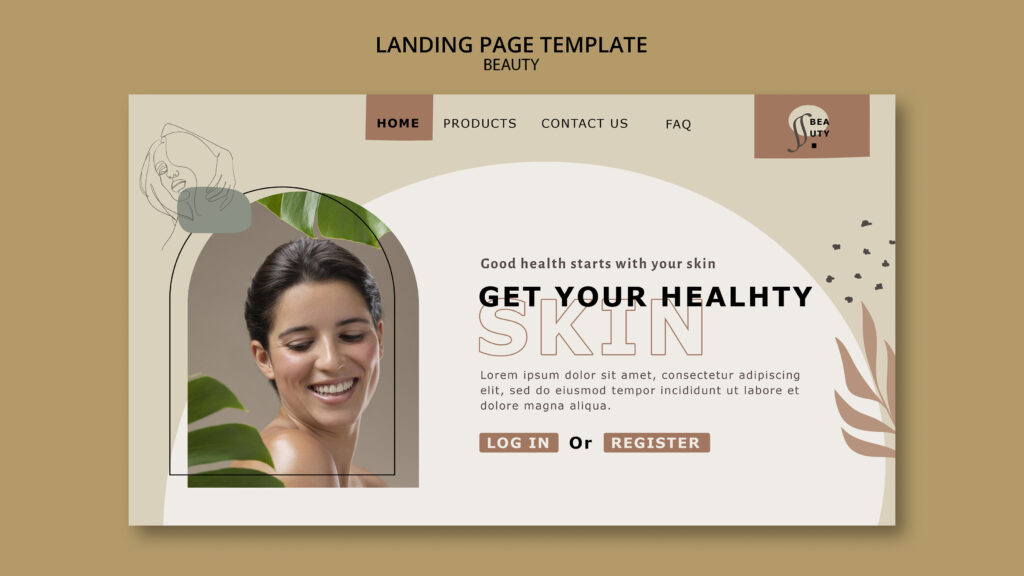

There’s no magic number, but there is a reliable rule for homepage CTAs for clinics: give the page one primary action, repeat it at natural pauses, and add only a few supporting options. Visitors then always know the main next step, and hesitant ones still have a gentle alternative. Too many competing buttons dilute that message, while too few leave interested visitors stuck. This guide shows how to count your CTAs properly, a sample layout you can adapt, and how to test what works for your clinic.
Count Actions, Not Buttons
Start by separating two ideas.
- Distinct actions are the different things you ask visitors to do, such as book a consultation, call, or read a guide.
- Button instances are the number of times a button appears on the page.
A homepage can show the same button four times and still ask for only one action. That’s usually fine. A homepage with eight different actions fights for attention, and that’s where trouble starts.
So the useful question isn’t “How many buttons?” It’s “How many different things am I asking for?”
The Rule: One Primary, a Few Supports
Use this simple structure.
- One primary action, such as “Book a consultation”. It appears several times, with identical wording and styling.
- One or two secondary actions, such as “Request a call back” or “Ask a question”. They’re gentler, and they look less prominent.
- A few pathways, such as links to treatment pages. These help people explore, but they aren’t calls to action in the strict sense.
Many clinic homepages work well with one primary action repeated three or four times, one or two secondary actions, and clear treatment links. Treat that as a starting point, not a law. Our post on call to action for clinics explains the difference between primary and secondary actions in more detail.
Why Too Many CTAs Hurt
More buttons can feel like more chances, but they come with costs.
- Visitors face several choices, so they may postpone all of them.
- The page loses a clear direction.
- Buttons compete visually, and none stands out.
- Pushy layouts feel like a sales funnel, which doesn’t suit a personal service.
- Tracking gets harder, because many actions blur the picture.
Why Too Few CTAs Hurt Too
A single button at the top isn’t enough either.
- Visitors who scroll find no next step when they’re ready.
- Hesitant patients have no gentler option, so they leave.
- Mobile visitors may need to scroll back up to act.
- Phone callers can’t find a tappable number.
The aim is clarity, not scarcity.
A Layout for Homepage CTAs for Clinics
Here is an illustrative layout. Adapt it to your clinic, and don’t treat it as a benchmark.
| Position | Role | Example wording |
|---|---|---|
| Header or menu | Small primary button | Menu button reading “Book a consultation” |
| Hero section | Prominent primary button, plus one gentle secondary | Hero button “Book a consultation”, with “Ask a question” beside it |
| After main treatments | Repeated primary button | Same button after each treatment group |
| After reviews or practitioners | Primary button with reassurance | Same button, with a line about the reply time |
| Mid-page prompt | Optional secondary | “Get our first-visit guide” |
| Closing section | Closing primary button, plus a phone option | Same button, plus “Call us” |
| Mobile sticky bar | Small primary and phone buttons | “Book” and “Call” in a thin bar |
Counting this layout, you’d have one primary action shown in five or six places, plus two or three secondary options. Every button still points to one main goal.
Choose the Primary Action Carefully
The primary action should suit most visitors, not just the most ready ones.
- For most clinics, “Book a consultation” or “Request a consultation” fits.
- If your clinic runs many different treatments, avoid listing every booking option in the hero. Offer one main route, and let treatment links guide people deeper.
- If consultation is free, paid, or credited, explain this clearly. Our post on free consultations for clinics helps you decide how to frame it.
Our post on CTA wording for clinics explains how to write the button itself.
Add Secondary Actions for Hesitant Visitors
Not everyone is ready on a first visit. Gentle options keep them close.
- “Ask a question” or “Request a call back” for people with a specific worry
- “See what to expect” or a first-visit guide for people still learning
- “Meet the team” for people judging whether they trust you
Keep these less prominent than the primary button, such as an outlined or text style. Offer one or two, not five.
Use Pathways to Help People Explore
A clinic homepage also acts as a map. Visitors want to find their treatment quickly.
- Show clear treatment categories, with short descriptions.
- Link to each treatment page with descriptive text, such as “Skin boosters” instead of “Learn more”.
- Keep this section clearly different in style from the main buttons, so it doesn’t compete with them.
Our post on treatment page conversion explains what visitors find after they click.
Think About Different Visitors
A homepage serves several groups at once.
- New visitors need reassurance and a clear route into your treatments.
- Comparing visitors look for proof, practitioners, and honest information.
- Returning patients want to rebook or contact you quickly.
- People ready to act need a visible, easy booking step.
One primary action, plus a few supports, covers all four without cluttering the page. Our post on search intent explains how visitors’ needs differ.
Mobile Changes the Count
Phones show less at a time, so layouts need extra care.
- Place the primary button within the first screen.
- Consider a small sticky bar with “Call” and “Book”. Make sure it doesn’t hide content or the form.
- Avoid several buttons side by side. They become hard to tap.
- Avoid pop-ups that cover the page.
- Test the page on a real phone.
Our posts on mobile load times and desktop versus mobile explain how to check performance.
Keep the Wording and Style Consistent
Repetition works when the button looks and reads the same each time.
- Use identical wording for the primary action, such as “Book a consultation”, everywhere.
- Use one button style for primary actions, and a different style for secondary ones.
- Make sure each button links to the same booking page, not to different destinations.
- Add a short reassurance line, such as your reply time, beside the first and last primary buttons.
Audit Your Homepage in Ten Minutes
- List every button and link that asks the visitor to do something.
- Label each one as primary, secondary, or pathway.
- Count the distinct actions. If you find more than three, ask which ones you can remove or demote.
- Check that identical actions use identical wording.
- Test on a phone, and see where the primary button appears.
- Click each one, and confirm that it works and links to the right place.
- Compare your layout with the sample above.
Measure and Test
Rely on your own data, not on a rule of thumb.
- Track clicks on each CTA with clean, generic event names and no personal details.
- Track what follows, such as form starts, submissions, and bookings.
- Check heatmaps, if your consent and privacy setup allows. Our post on heatmaps for clinic websites explains how.
- Compare changes carefully. Make one change, wait several weeks, and compare enquiries and bookings. Allow for seasonal swings.
- Check quality, such as whether enquiries become attended appointments.
If your traffic is low, a formal split test may not be reliable. Our post on A/B testing for clinics explains what to do instead.
Privacy and Rules
- Follow your regulator’s rules on advertising treatments, offers, and prescription-only products in any button or supporting line.
- Avoid guarantees, false urgency, and exaggerated claims.
- Follow consent rules before you track clicks or visitors.
- Keep names, contact details, and health details out of analytics, page addresses, and event labels.
Rules vary by country, so ask a qualified adviser to review your homepage.
Common Mistakes
- Asking for many different things. Visitors freeze when every button says something new.
- Using one button only. Ready visitors scroll and find nothing.
- Changing the wording each time. Consistency builds recognition.
- Making every button equally loud. Nothing stands out.
- Sending buttons to different pages. The journey becomes confusing.
- Hiding the phone number. Some patients prefer to call.
- Ignoring mobile. Most visitors use phones.
- Counting buttons without checking results. Enquiries and attended appointments are the real test.
A Simple Plan
- First week: Audit your homepage, and label each CTA as primary, secondary, or pathway.
- Second week: Choose one primary action, and unify its wording and destination.
- Third week: Reduce secondary actions to one or two, and add reassurance beside the first and last primary buttons.
- Fourth week: Check the mobile layout, set up click tracking, and note your baseline. Then review the results after a few weeks.
The Takeaway
The ideal number of homepage CTAs for clinics isn’t a fixed count. Aim for one primary action, repeated at natural pauses with identical wording, plus one or two gentler secondary options and clear treatment pathways. Count distinct actions, not button instances, and keep them to a small number. Make the layout work on phones, keep every button linked to the right page, and follow advertising and privacy rules. Then measure enquiries and attended appointments, and adjust one thing at a time.
Want a homepage that guides visitors to book? [Book a free website audit] and we’ll review your buttons, layout, and booking path.