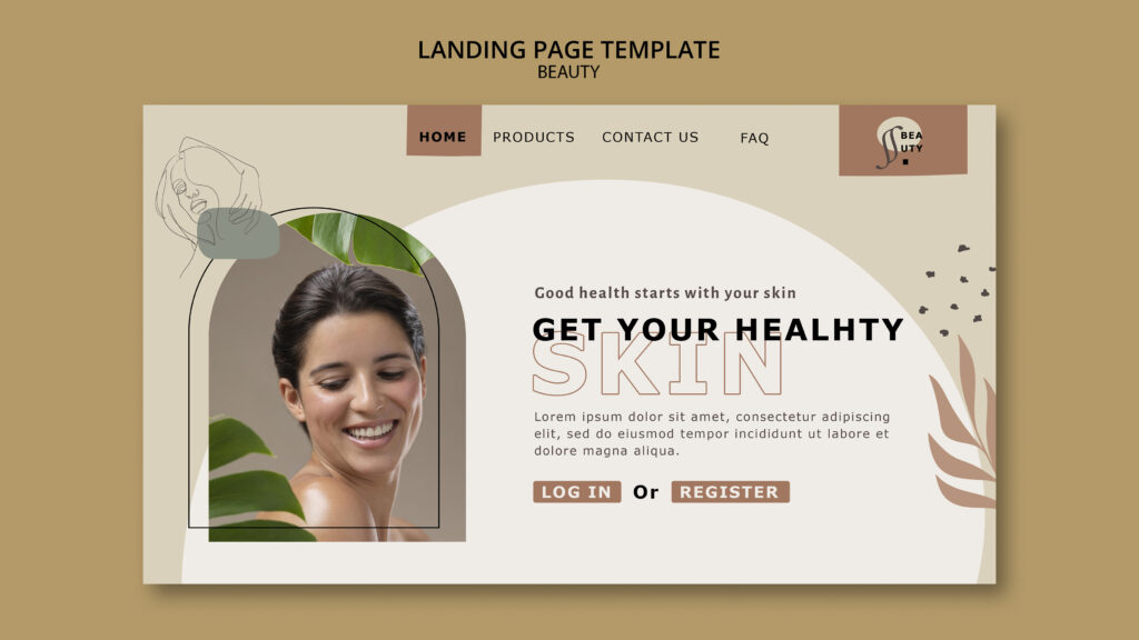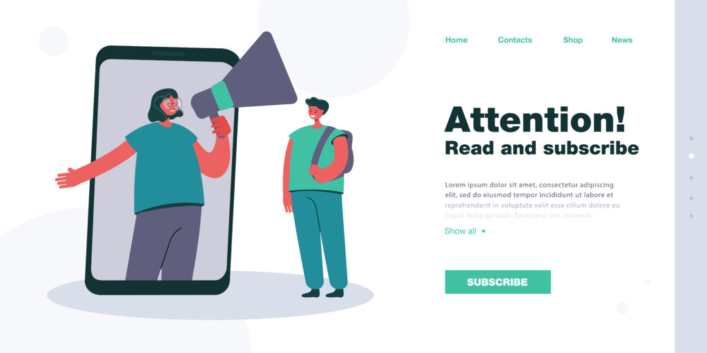
Calls to action guide behaviour.
They tell visitors what to do next.
Yet many aesthetic clinic websites get this wrong.
As a result, visitors leave without booking.
What a Call to Action Really Is
A call to action is not just a button.
It is a clear instruction.
For example:
- Book a consultation
- Request a callback
- Speak to our team
Strong CTAs reduce hesitation.
Mistake One: Using Too Many Calls to Action
More buttons do not mean more bookings.
Too many CTAs create confusion.
Visitors stop deciding and start scrolling.
Clarity beats choice every time.
Mistake Two: Vague CTA Wording
“Learn more” feels safe but weak.
It does not explain the benefit.
Clear CTAs feel more confident.
For example:
- Book your skin consultation
- Speak with a qualified practitioner
Specific wording increases clicks.
Mistake Three: Pushing Booking Too Early
Some visitors are not ready.
Forcing “Book now” immediately creates pressure.
Instead, guide users step by step.
Education should come before commitment.
Mistake Four: Ignoring Emotional Readiness
Aesthetic decisions are emotional.
Clients need reassurance.
CTAs should feel supportive, not aggressive.
Soft confidence works better than urgency.
Mistake Five: Inconsistent CTAs Across Pages
Different pages often use different actions.
This breaks the journey.
Visitors feel lost.
One clear primary action works best.
Mistake Six: Hiding CTAs in Poor Locations
A CTA must be easy to find.
Common mistakes include:
- Small buttons
- Low contrast colours
- Poor placement
Visibility matters.
Mistake Seven: Using Sales-Led Language
Hard selling reduces trust.
Phrases like “Limited offer” feel risky.
Calm language feels safer.
Safety matters in aesthetics.
What High-Performing Clinic Websites Do Instead
Successful clinics:
- Use one main CTA per page
- Match CTAs to page intent
- Keep wording clear and calm
- Repeat CTAs naturally
This reduces friction.
How CTAs Support Better Lead Quality
Good CTAs filter visitors.
They attract:
- Prepared clients
- Serious enquiries
- Better consultations
Poor CTAs attract everyone.
Align CTAs With Page Purpose
Every page has a job.
For example:
- Blog pages educate
- Service pages guide
- Consultation pages convert
CTAs should match the page goal.
Design and CTA Work Together
Design frames decisions.
Buttons should:
- Stand out
- Feel intentional
- Match branding
Design supports trust.
Why Mobile CTAs Matter More Than Ever
Most users are on mobile.
Mobile CTAs must:
- Be easy to tap
- Load quickly
- Stay visible
Poor mobile CTAs lose bookings.
How Devmart Builds Conversion-Focused CTAs
At Devmart, we design CTAs with intent.
We focus on:
- User readiness
- Clear messaging
- Visual clarity
- Conversion flow
This improves enquiry quality.
What You Can Fix Today
Check your website and ask:
- Are CTAs clear?
- Are there too many?
- Do they feel supportive?
- Do they match page intent?
Small changes bring big results.
Final Thoughts
Calls to action guide trust, not pressure.
When CTAs feel clear and calm, bookings increase.
In 2026, thoughtful CTAs will outperform aggressive ones.
check our recent case study — click here