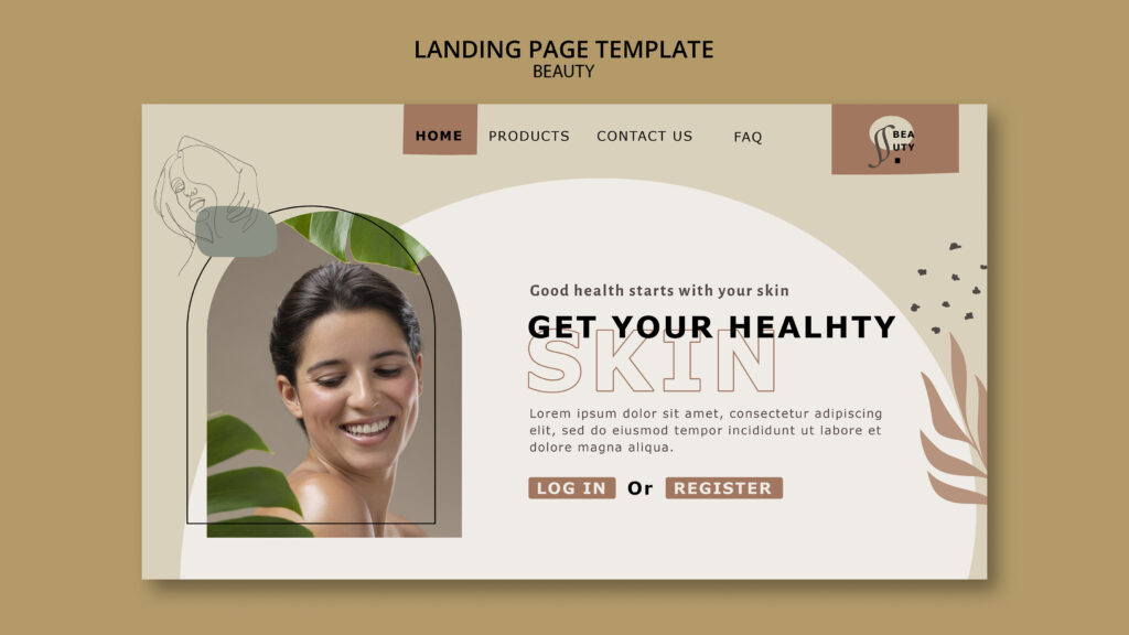

Clinic page design affects enquiries because patients judge a clinic by how its page looks and feels, often within seconds. A calm, clear, fast page suggests a careful clinic. A cluttered, slow, or confusing page suggests the opposite, and many visitors leave before they read a word. Good design isn’t decoration, though. It’s how the page guides attention, answers worries, and makes the next step obvious. This guide explains which design choices help patients enquire, which push them away, and how to review your own pages.
Design Is Not Just How a Page Looks
Design decides three things for every visitor.
- What she notices first: The headline, image, or button that catches her eye.
- How easily she understands: Whether the page answers her questions without effort.
- What she does next: Whether the next step feels obvious, safe, and easy.
A beautiful page that hides the booking button fails. A plain page with a clear message and a visible button can outperform it. So judge design by what visitors do, not by how impressive it looks.
The Five-Second Test
Visitors form an impression quickly. Test your page the way a stranger would.
- Show the page to someone who doesn’t know your clinic, for about five seconds.
- Hide it, and ask what the clinic does, where it is, and what the page wants her to do.
- Note what she remembers and what she misses.
- Repeat with two or three people.
If they can’t answer, the design isn’t communicating. Fix the headline, the main image, and the primary button first.
Clinic Page Design Principles That Support Enquiries
Make the hierarchy obvious
Visual hierarchy tells visitors what matters most. Use size, position, and contrast to rank elements.
- The headline should be the largest text on the page.
- The primary button should stand out more than any other button.
- Supporting text should look clearly secondary.
- Related items should sit together, with space between groups.
When everything shouts, nothing gets noticed.
Put the answers above the fold
The first screen should say what the treatment is, where the clinic is, and how to take the next step. Visitors shouldn’t need to scroll to find the basics, especially on phones.
Use white space generously
Space isn’t wasted. It makes content easier to read, and it signals calm and quality, which suits aesthetics. Crowded pages feel stressful.
Write for scanning
Most visitors skim before they read.
- Use clear subheadings that describe what follows.
- Keep paragraphs short.
- Use lists for steps and options.
- Put the key point first in each section.
- Bold only what truly matters.
Choose readable typography
Text must be easy to read on a small screen.
- Use a comfortable body size, with generous line spacing.
- Limit yourself to one or two typefaces.
- Avoid long lines of small text.
- Keep decorative fonts for headings, and use them sparingly.
Our post on font loading and website speed explains how fonts affect performance.
Use colour with purpose
Colour guides attention and sets the mood.
- Choose a calm palette that fits your brand.
- Reserve your strongest colour for the primary button.
- Make sure text has enough contrast against its background.
- Never rely on colour alone to convey meaning.
Choose honest, real imagery
Images shape trust faster than text.
- Use real photos of your clinic, team, and rooms, where possible.
- Show people only with their consent.
- Avoid stock photos that pretend to be your staff.
- Check your regulator’s rules on before-and-after images, which are restricted or banned in some places.
- Compress images, and add descriptive alt text.
- Avoid heavy sliders and auto-playing video, which slow the page and distract.
Design the call to action to stand out
The button should look like a button, with clear wording and enough space around it. Place it near the top, after key information, and at the end. Our posts on call to action for clinics and homepage CTAs for clinics explain placement and numbers.
Keep navigation simple
Visitors should find treatments, pricing, and contact details in a couple of taps.
- Use clear menu labels, such as “Treatments”, “Team”, “Prices”, and “Contact”.
- Limit the number of top-level items.
- Keep the booking button visible in the header.
- Make the phone number tappable on mobile.
Design forms to feel easy
A form is part of the page design.
- Ask only for what you need. Our post on enquiry form fields explains how.
- Place labels above fields.
- Make fields large enough to tap.
- Show a short privacy note beside the button.
- Display clear, friendly error messages.
Our post on the trustworthy booking form covers how to make it feel safe.
Design That Pushes Patients Away
Some choices reliably drive visitors off the page. The table below links common problems to their effect and a fix.
| Design problem | Why patients leave | What to do instead |
|---|---|---|
| Cluttered layout | She can’t tell where to look | Remove extras, and group related content |
| Pop-ups that cover content | They block the page and feel pushy | Delay or drop them, and never cover the form |
| Tiny text or low contrast | It’s hard to read, especially on phones | Increase size and contrast |
| Hidden or weak buttons | She doesn’t see the next step | Make the primary button clear and consistent |
| Slow loading | She leaves before the page appears | Compress images, and limit heavy scripts |
| Stock-photo overload | The clinic feels generic or unreal | Use genuine photos with consent |
| Walls of text | Reading takes too much effort | Break up text with headings and lists |
| Inconsistent styles | The site feels unreliable | Use one set of fonts, colours, and button styles |
| Layout that jumps as it loads | Buttons move, and she taps the wrong thing | Reserve space for images and embeds |
Mobile Design Matters Most
Most clinic visitors use phones, so design for small screens first.
- Put the primary button within the first screen.
- Keep text and buttons large enough to tap easily.
- Leave space around tappable items.
- Avoid several buttons side by side.
- Consider a small sticky bar with “Call” and “Book”, provided it doesn’t cover content.
- Test on a real mid-range phone with mobile data.
Our posts on mobile load times and desktop versus mobile explain how to check.
Speed Is Part of Design
A slow page is a poorly designed page, because visitors judge delays as carelessness.
- Compress and size images properly.
- Limit fonts and heavy scripts.
- Avoid auto-playing video at the top of the page.
- Reserve space, so the layout doesn’t shift.
Our posts on booking page speed, third-party scripts, and cumulative layout shift explain the fixes.
Accessible Design Helps Everyone
Accessible pages are easier to use for all patients, including those with vision, hearing, or motor difficulties.
- Provide enough colour contrast.
- Write descriptive link text, such as “Read about skin booster aftercare” instead of “Click here”.
- Add alt text to meaningful images.
- Make the page usable with a keyboard and screen reader.
- Label every form field.
- Avoid content that flashes or moves automatically.
Accessibility isn’t only a legal matter in many places. It also widens your audience.
Design Details That Build Trust
Small touches signal a careful clinic.
- A consistent logo, colours, and tone across pages
- Real practitioner photos and names
- Clear contact details and opening hours
- Visible, honest proof near the button
- A tidy footer with policies and registration details
Our post on trust signals for clinics lists what to include.
Review Your Page: A Design Audit
Score each item from 0 to 2: 0 means missing, 1 means partly there, and 2 means strong. Then fix the lowest scores first.
| Area | What to check |
|---|---|
| First screen | Does it say what, where, and what to do next? |
| Hierarchy | Does the eye go to the headline and the primary button? |
| Readability | Is text large, spaced, and contrasted enough on a phone? |
| Imagery | Are images real, consented, and compressed? |
| Navigation | Can visitors reach treatments, prices, and contact quickly? |
| Buttons | Is one primary action clear and consistent? |
| Forms | Are they short, easy, and reassuring? |
| Mobile | Does everything work on a small screen? |
| Speed | Does the page load quickly, without jumping? |
| Accessibility | Can everyone use it, including with a keyboard? |
Run the audit on your homepage, top treatment pages, and booking page first.
Measure the Effect of Design Changes
Check that changes help.
- Record a baseline. Note enquiry rate, button clicks, and bounce or engagement for the page. Our post on website conversion rate explains how.
- Change one thing. For example, simplify the first screen, or make the button clearer.
- Watch behaviour. Heatmaps may show where visitors tap or stop. Our post on heatmaps for clinic websites explains how, with privacy care.
- Compare after several weeks. Look at enquiries and attended appointments, not only clicks. Allow for seasonal swings.
- Ask patients what they noticed, or what almost stopped them.
With low traffic, make clear improvements and compare before and after. Our post on A/B testing for clinics explains when a formal test makes sense.
Privacy and Rules
- Follow your regulator’s rules on advertising treatments, images, offers, and prescription-only products.
- Check rules on before-and-after images, which vary widely.
- Get written consent before you show patient photos.
- Follow consent rules before you track visitors or run recording tools.
- Keep names, contact details, and health details out of analytics, page addresses, and event labels.
- Avoid guarantees and exaggerated claims in headlines and captions.
Rules vary by country, so ask a qualified adviser to review your pages.
Common Mistakes
- Designing for looks only. Visitors need clarity and a next step.
- Cramming too much onto one page. Choose what matters.
- Using stock photos as staff. This misleads and weakens trust.
- Hiding the primary button. It can’t win enquiries if nobody sees it.
- Ignoring mobile. Most visitors use phones.
- Adding heavy effects. Sliders and animations slow pages down.
- Leaving out contrast and alt text. This excludes some patients.
- Never testing with real people. Your team already knows the site, so you can’t judge it fresh.
- Changing everything at once. You can’t tell what worked.
A Simple Plan
- First week: Run the five-second test and the design audit on your top three pages.
- Second week: Fix the first screen, the button, and the mobile layout.
- Third week: Improve readability, imagery, and forms, and compress images.
- Fourth week: Check speed on a phone, review your numbers against your baseline, and pick the next improvement.
The Takeaway
Clinic page design decides whether patients enquire or leave by guiding what they notice, how easily they understand, and whether the next step feels safe and simple. Make the hierarchy obvious, answer the basics on the first screen, use real imagery and calm, readable layouts, and design the button and form to be easy. Treat mobile, speed, and accessibility as part of design, not extras. Then audit your key pages, change one thing at a time, and measure enquiries and attended appointments.
Want a page design that turns more visitors into patients? [Book a free website audit] and we’ll review your layout, mobile experience, and booking path.