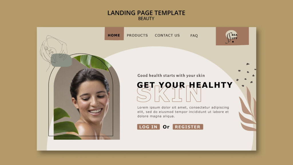

A call to action for clinics tells visitors what to do next, such as “Book a consultation” or “Call us today”. Without one, many visitors browse, enjoy the photos, and leave. With a clear one, more of them take the next step. This guide explains what a call to action is, which wording works, where to place it on each type of page, and how to test it.
What a Call to Action Is
A call to action, often shortened to CTA, is a prompt that asks the visitor to take one specific step. It usually appears as a button, a link, or a short line of text.
Common examples for clinics include:
- Book a consultation
- Call the clinic
- Request a call back
- Send an enquiry
- Download our aftercare guide
- Join our newsletter
Each one invites a different level of commitment. So the right choice depends on where the visitor is in their decision. Our post on search intent explains how visitors differ.
Why Calls to Action Matter
Visitors rarely work out the next step on their own. Instead, they follow the path you make obvious.
- A clear CTA reduces effort, because people don’t have to hunt for a way to get in touch.
- The page gains a direction, since the button signals what you want them to do.
- Interest gets captured at the moment it’s strongest.
- Finally, results become easier to measure, since you can count clicks.
As a result, a well-placed CTA often lifts enquiries without any extra traffic. Our posts on website conversion rate and on improving conversion without more traffic explain how to measure and improve results.
Two Kinds of Call to Action
Not every CTA asks for a booking.
Primary call to action
This is the main action you want on a page. For a treatment page, it’s usually “Book a consultation”. Each page should have one primary CTA.
Secondary call to action
This is a gentler step for visitors who aren’t ready. Examples include “Read the aftercare guide”, “See our reviews”, or “Join our newsletter”. Secondary CTAs keep interested people in touch.
Make the primary one stand out most. Then let the secondary ones support it, without competing.
How to Write a Good Call to Action
Good wording is clear, specific, and low-pressure.
- Start with a verb. For example, “Book”, “Call”, “Request”, or “Download”.
- Say what happens next. “Book a consultation” is clearer than “Submit”.
- Match the visitor’s stage. Early visitors may prefer “Read our guide”, while ready visitors may want “Book now”.
- Keep it short. Two to five words work well on a button.
- Add a supporting line if it helps, such as “Free, no-obligation chat” where that’s true, or “We reply within a few hours.”
- Stay honest. Never promise results or use false urgency.
The table below compares weak and stronger wording.
| Wording | Why it’s weak or strong |
|---|---|
| Submit | Weak: it says nothing about the benefit or next step |
| Click here | Weak: it doesn’t explain what happens |
| Learn more | Often vague, so say what they’ll learn |
| Book a consultation | Stronger: clear action and clear outcome |
| Request a call back | Stronger: low effort, and the next step is obvious |
| Get our aftercare guide | Stronger: offers something useful in return |
Rules for Wording in Healthcare
Clinic advertising is regulated, so choose words carefully.
- Avoid guarantees, such as “Guaranteed results”.
- Avoid pressure tactics, such as “Last chance” or “Only two slots left”, unless they’re true and your rules allow them.
- Be careful with offers and discounts. Many regulators restrict them for certain treatments.
- Don’t promote prescription-only products directly to the public where that’s prohibited.
- Say “consultation” where a practitioner must assess the patient first.
Rules vary by country. Ask a qualified adviser if you’re unsure.
Where to Place Your Call to Action
Placement matters as much as wording. Use the page type to decide.
| Page | Where to place the CTA | Suggested primary action |
|---|---|---|
| Homepage | In the top section, and again after your main treatments | Book a consultation |
| Treatment page | Near the top, after the key information, and at the end | Book a consultation for this treatment |
| Blog post or guide | Midway where it fits, and at the end | Read the related treatment page, or book a consultation |
| Contact page | At the top, next to your contact options | Call, message, or send an enquiry |
| Booking page | At the form or calendar, with a clear confirmation | Confirm booking |
| Team page | Beside practitioner profiles | Book with this practitioner |
| Pricing page | After the price information | Request a consultation |
| Reviews page | After the reviews | Book a consultation |
Then repeat the main CTA at natural pauses. For example, after you answer a worry, offer the next step.
Placement Principles
Keep these ideas in mind.
- Above the fold: Put a CTA where visitors can see it without scrolling, especially on mobile.
- After value: Place another after you’ve explained something useful. Visitors are then more ready to act.
- At the end: Visitors who read to the bottom are interested, so give them a clear next step.
- Near doubts: If a section raises a worry, such as risks or price, add a CTA after your honest answer.
- Consistently: Use the same wording and style, so visitors recognise it.
- Not too many: Too many buttons feel pushy and confusing.
Mobile Placement
Most patients browse on phones, so design for them first.
- Make buttons large enough to tap easily.
- Leave space around buttons, so people don’t tap the wrong thing.
- Consider a small sticky bar with “Call” and “Book” at the bottom of the screen. Make sure it doesn’t cover content or the form.
- Make the phone number tappable.
- Avoid pop-ups that block the page.
- Test on a real phone.
Our posts on mobile load times and desktop versus mobile explain how to check mobile performance.
Design a Call to Action That Stands Out
Design should make the CTA easy to spot.
- Contrast: Use a colour that stands out from the background, with enough contrast for readability.
- Size: Make it clearly visible, but not oversized.
- White space: Leave room around it.
- Consistency: Use one button style for primary actions.
- Clarity: Make it look like a button, not like body text.
- Accessibility: Use readable text, clear focus states for keyboard users, and descriptive labels for screen readers.
A CTA that blends into the page gets missed.
Pair the CTA With Reassurance
Visitors hesitate when they feel uncertain. So add short reassurance near the button.
- Explain what happens after they click.
- Mention your reply time.
- Show qualifications or a review nearby.
- Add a short privacy note beside any form.
- Say whether a consultation costs anything, if it’s accurate.
Our post on patient trust explains why reassurance matters.
Make Sure the Next Step Works
A good CTA fails if what follows is broken.
- Link to the right page. Send “Book a consultation” to the booking page, not the homepage.
- Check that forms, phone links, and calendars work on phones.
- Keep forms short. Our post on booking form abandonment explains how.
- Send an automatic confirmation.
- Reply quickly, ideally within a few hours.
Our post on more patient enquiries explains the contact options in more detail.
Match the CTA to Where Visitors Came From
Visitors from different sources may want different next steps.
- Ad or email visitors may be ready for “Book a consultation” on a matching landing page.
- Blog readers may prefer a guide or a related treatment page first.
- Social visitors may need more reassurance before a booking prompt.
- Map visitors often want contact details and directions quickly.
Our posts on landing pages and on traffic to treatment pages explain how to match pages to sources.
Track Your Calls to Action
Measure which ones work.
- Track clicks on buttons and phone links as events in Google Analytics. Menu names change, so follow the current layout.
- Track the next step, such as form starts, form submissions, and bookings.
- Compare pages, to see which CTAs get clicks.
- Compare devices and sources.
- Look beyond clicks. A CTA that gets clicks but no enquiries may point to a weak page.
Use clear, generic event names. Never put names, emails, or health details into event labels. Our post on tracking website visitors explains how.
How to Test and Improve
Test one change at a time.
- Try different wording, such as “Book a consultation” versus “Request a consultation”.
- Move the button higher or lower.
- Change its colour or size.
- Add or remove a short supporting line.
Run each test for several weeks, so you have enough visits to compare. With low traffic, make bigger, clearer improvements instead of small tweaks. Keep notes on what you changed and what happened.
Privacy and Rules
- Follow consent rules in your region before you track clicks or visitors.
- Keep names, contact details, and health details out of analytics, page addresses, and event labels.
- Don’t collect health information through open forms.
- Describe treatments, risks, and limits honestly.
- Follow your regulator’s rules on advertising treatments, offers, and prescription-only products.
Rules vary by country, so ask a qualified adviser to review your wording and setup.
A Simple Checklist
Use this list on each key page.
- The page has one clear primary call to action.
- The wording starts with a verb and says what happens next.
- A CTA is visible without scrolling on a phone.
- Another appears after the main information and at the end.
- Reassurance sits near the button.
- The button links to the right page.
- The form or phone link works on a phone.
- Clicks are tracked with clean event names.
- The wording follows advertising rules.
Common Mistakes
- Having no call to action. Visitors don’t know what to do.
- Offering too many choices. One clear primary action works best.
- Using vague wording. “Submit” and “Click here” say little.
- Hiding the button. Low contrast or a footer position loses clicks.
- Sending clicks to the homepage. Visitors get lost.
- Using pressure or false urgency. This harms trust and may break rules.
- Ignoring mobile. Small buttons and blocked screens lose enquiries.
- Skipping tracking. You can’t improve what you can’t see.
- Forgetting follow-up. A fast, friendly reply completes the job.
The Takeaway
A call to action for clinics tells visitors what to do next, and it works best when it’s clear, honest, and easy to find. Give each page one primary action, add gentler secondary steps, and place the main button near the top, after your key information, and at the end. Make it work on phones, reassure visitors nearby, and link it to the right page. Then track clicks, test one change at a time, and follow advertising and privacy rules throughout.
Want a clearer call to action on every key page? [Book a free website audit] and we’ll review your buttons, pages, and tracking.