
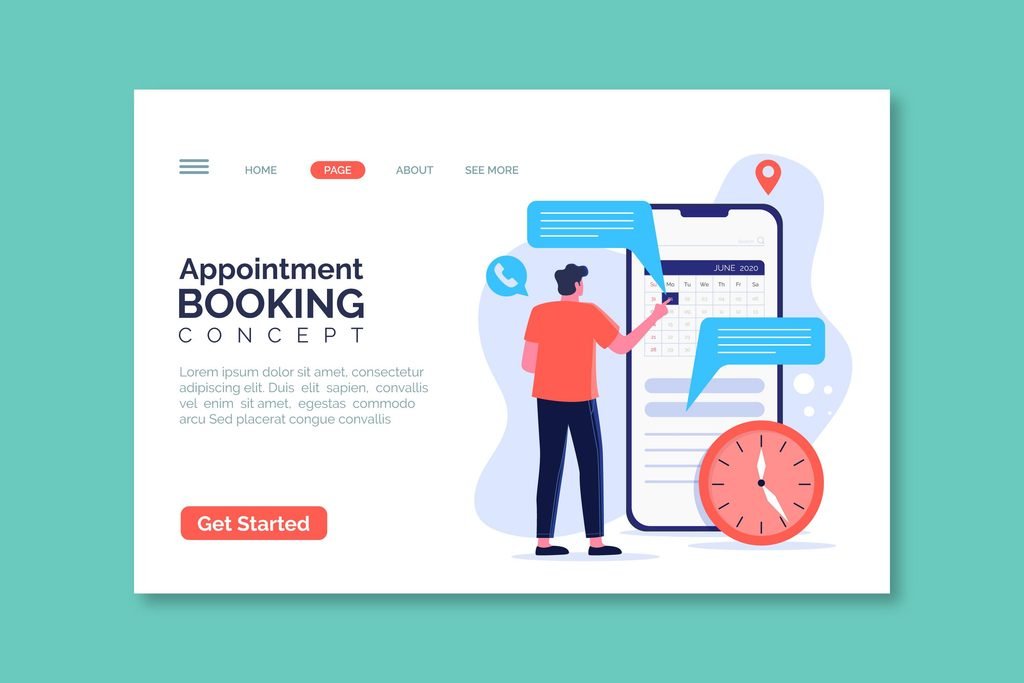
Booking a consultation is often the first real interaction a patient has with your practice — the moment research turns into action. A clunky, generic booking process can undercut everything a beautifully designed website built up to that point, while a genuinely considered booking experience extends the premium feeling right up to the moment a patient walks through your door.
This goes beyond the basic “make booking fast” advice covered in our piece on conversion design — this is specifically about how the booking experience itself can feel elevated, not just efficient.
Why the Booking Moment Matters So Much
Up until the booking step, a patient has been evaluating your practice from a distance — browsing, comparing, building trust. The moment they commit to booking is when that evaluation turns into a real, personal decision: sharing their name, contact information, and often some detail about what’s bringing them in. A booking experience that feels rushed, impersonal, or overly transactional can introduce doubt at exactly the moment confidence matters most.
What a Premium Booking Experience Looks Like
A calm, uncluttered booking interface
The booking flow itself — whether a custom form or a third-party scheduling tool — should visually match the rest of your site’s design language, not feel like a generic plugin bolted onto a polished site. Mismatched fonts, default colors, or an obviously third-party-branded widget can undercut the premium feeling right at the final step.
Thoughtful, not exhaustive, questions
Asking only what’s genuinely needed to schedule (name, contact info, treatment of interest, preferred timing) keeps the process quick, as covered in more depth in the conversion design post. But a premium touch goes further: an optional field like “Is there anything specific you’d like to discuss during your consultation?” signals that the practice genuinely wants to understand the patient’s goals, not just fill a time slot.
Clear expectation-setting before booking
Briefly explaining what the consultation itself will involve — how long it takes, what to expect, whether there’s a fee — reduces the small anxiety that often accompanies booking something unfamiliar. This is a simple addition that meaningfully changes how the whole process feels, from transactional to considered.
A confirmation experience that feels personal
A generic “Thank you, we’ll be in touch” message is a missed opportunity. A confirmation page (and follow-up email) that reflects your actual brand voice, reiterates what to expect, and perhaps includes a warm note from the practice extends the same care patients will feel in person, right from the first confirmation.
Smooth, low-friction rescheduling
Patients occasionally need to reschedule, and a premium experience makes that easy rather than requiring a phone call during business hours. A simple self-service reschedule link in the confirmation email removes friction at a moment that could otherwise become frustrating.
The Role of Automation Without Feeling Automated
Automated confirmations, reminders, and follow-ups are genuinely useful and expected at this point — the goal isn’t to avoid automation, but to make it feel considered rather than generic. A few specific choices help:
- Write automated messages in your actual brand voice, not the default template language a booking tool ships with.
- Time reminders thoughtfully — a reminder the day before, rather than an overwhelming sequence of multiple touches that can feel more like a sales funnel than genuine care.
- Include something useful, not just a reminder — a brief note on how to prepare for the specific treatment they’re coming in for adds real value beyond a bare appointment reminder.
What Undercuts the Premium Feeling
- A booking widget that looks visually disconnected from the rest of the site — an obvious sign the tool was implemented quickly without design attention.
- Overly long forms that feel more like an intake questionnaire than a simple booking step — save detailed medical history for the actual consultation, not the initial booking form.
- Generic, robotic confirmation language that reads like an unedited template.
- No clear next step after booking — a patient who books and then hears nothing until their appointment date can be left wondering if the booking actually worked.
- Friction around cancellation and rescheduling that requires a phone call, when most other parts of the process were self-service — this inconsistency stands out precisely because the rest of the experience was smooth.
A Simple Way to Audit Your Current Booking Flow
Book a mock consultation on your own site, as if you were a first-time patient, and pay attention to how it feels at each step — not just whether it technically works. Does the visual design feel consistent with the rest of your site? Does the confirmation feel personal or generic? Would you, as a patient, feel confident and cared for, or just processed?
The Underlying Principle
A premium clinic experience shouldn’t have a gap between the website and the actual booking process — the two should feel like a continuous, considered experience rather than a polished front door leading into a generic back office. Treating the booking flow with the same intentionality as your homepage and service pages is a relatively small investment that extends your practice’s premium feeling exactly where trust is being tested for the first time.
Curious how your current booking experience actually feels to a new patient? [Book a free website audit] and we’ll walk through it together.

