
TL;DR
The best clinic website examples in 2026 share a pattern: above-the-fold booking CTAs, visible practitioner credentials, transparent pricing, and fast mobile performance. This guide analyzes 16 real clinic websites across the US, UK, and Australia, names their exact booking engines (Boulevard, Pabau, Acuity, and others), and extracts the conversion tactics worth copying. Whether you run a boutique aesthetics practice or a multi-location chain, these examples give you a practical blueprint for turning site visitors into booked consultations.
Don’t Copy Pretty. Copy What Books.
Most roundups of clinic website examples show you an attractive screenshot and a vague compliment. “Clean design!” “Love the vibe!” That tells you nothing about whether the site actually generates bookings.
The real question is always conversion. Does a new patient see a booking button within seconds? Are practitioner credentials visible before the first scroll? Is pricing clear enough that visitors don’t bounce to a competitor who answers their questions?
A survey of 1,000 consumers found that 80% would use online scheduling if their provider offered it. But actual adoption trails far behind: only 35% have booked via desktop and 19% via smartphone. That gap between demand and behavior is a friction problem. The sites in this guide close it.
For each example below, we identify the booking stack, highlight what to copy, and flag honest tradeoffs. If you’re unclear on why a professional website matters for aesthetic clinics in the first place, the short answer is that patients judge clinical quality by digital quality. These 16 sites prove it.
What Winning Clinic Websites Get Right in 2026
Before the individual examples, it helps to know the patterns they share.
Self-serve booking is the default, not a bonus. The “Book Now” button sits above the fold, links directly to a scheduling flow, and shows availability without requiring a phone call. The best sites use dedicated booking engines (Boulevard, Pabau, Acuity) rather than generic contact forms.
Trust loads before the scroll. Practitioner headshots with credentials, a review score or count, and a press mention or “as seen in” bar all appear in the first viewport. Reviews and testimonials directly influence conversion rates, especially for treatments where patients need to trust a specific person.
Mobile speed is non-negotiable. Most clinic discovery happens on phones. Google’s case studies show that conversion drops as load time increases. The Farfetch study on web.dev documented measurable conversion dips tied directly to Largest Contentful Paint (LCP) delays. For clinics, this means compressing images, skipping autoplay video, and building with site speed as a ranking and conversion factor.
Compliance is designed in, not patched on. UK clinics face specific restrictions from the ASA and MHRA. Botox is a prescription-only medicine (POM) and cannot be promoted to the public. The best UK clinic websites use “anti-wrinkle injections” or “consultation for injectable treatments” instead. We flag compliance throughout the examples below.
How We Selected These Clinic Website Examples
These 16 examples span the US, UK, and Australia. They cover solo practitioners, mid-size practices, and national chains. Selection criteria: visible booking flows, identifiable booking engines, standout conversion features (pricing transparency, reviews, practitioner bios, memberships, before/after galleries), and diversity in clinic model. Where possible, we confirmed the booking platform by inspecting the link URL domain.
At-a-Glance: All 16 Clinic Website Examples Compared
| Clinic | Region | Booking Engine | Best For | Standout Element | Key Note |
|---|---|---|---|---|---|
| Brilliance Aesthetics | Australia | Acuity | Solo practitioner, premium feel | Homepage reviews block | Built by DevMart |
| AkeMedics Beauty | UK | Aesthetic Nurse Software | Nurse-led compliant clinic | Embedded Google reviews | Built by DevMart |
| SkinSpirit | USA | Proprietary (enterprise) | Multi-location with retail | Location finder + e-commerce | 50+ locations |
| Upkeep Med Spa | USA | Boulevard | Price-transparent booking | Visible treatment pricing | NYC and Dallas |
| Dr David Jack Clinics | UK | Pabau | Luxury trust stacking | Press quotes, B-Corp, bios | London multi-site |
| JECT | USA | Enterprise webstore | Membership-driven injectables | Account-based perks | NYC, LA, Miami |
| Sisu Clinic | US/IE/UK | Phorest ecosystem app | Flat transparent pricing | “One flat price” messaging | Doctor-founded |
| City Skin Clinic | UK | Custom (form + video) | Tele-dermatology | Dual booking paths | Virtual-first |
| SEV Laser | USA | In-house (site + app) | Chain loyalty with “what to expect” | Dedicated loyalty app | Price-forward chain |
| LaserAway | USA | Custom (enterprise) | High-volume intake funnels | Decision-tree booking | National chain |
| Mabrie Facial Institute | USA | Custom | Doctor-led education depth | Interactive concern navigator | San Francisco |
| Juvly Aesthetics | USA | Integrated self-scheduling | Policy transparency | Dedicated policies hub | Multi-state |
| Evolve Med Spa | USA | Custom | Editorial brand storytelling | Location-specific team pages | NY/NJ |
| Thérapie Clinic | EU/US | Custom | Large chain “free consult” entry | Free consultation default CTA | EU + US chain |
| Contour Clinics | Australia | Custom app | App-based ecosystem | App for booking + rewards | Multi-location AU |
| Peachy Studio | USA | Custom | Flat-rate messaging at scale | “Flat fee” positioning | Multi-city injectables |
16 Clinic Website Examples That Actually Convert
1. Brilliance Aesthetics
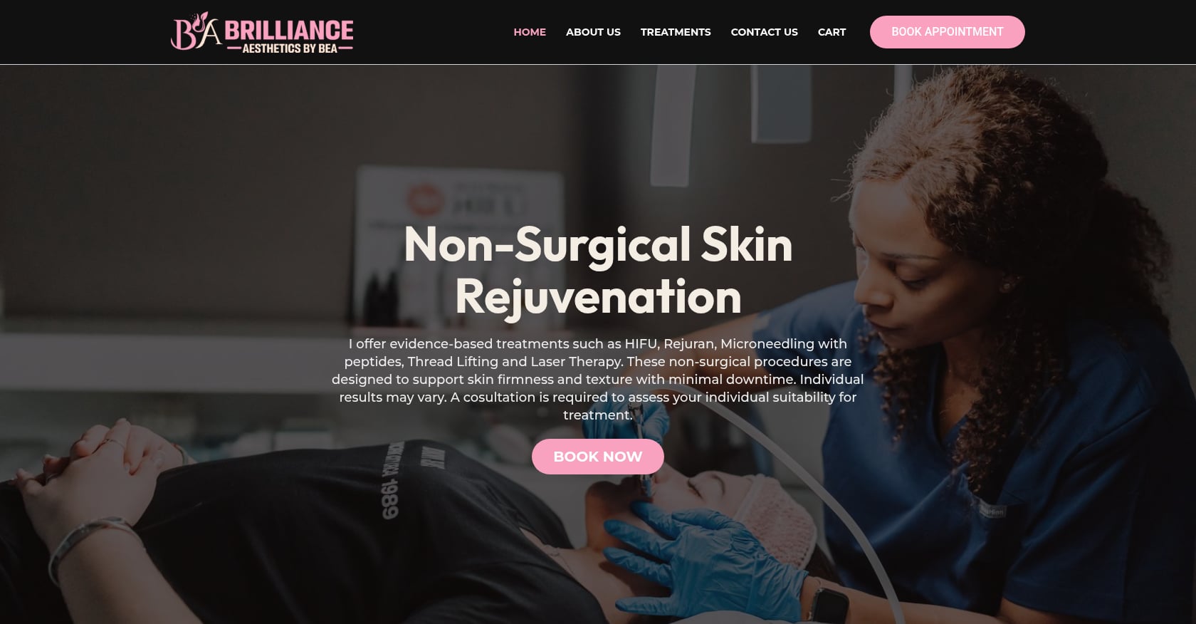
Best for: Solo practitioners building a premium online presence without enterprise complexity.
This Australian aesthetics practice shows how a single practitioner can project the authority of a larger clinic. The homepage places “Book Now” above the fold, loads a reviews block early, and keeps the tone clean and clinical.
- Above-the-fold CTA links straight to the scheduling calendar
- Reviews snippet on the homepage creates immediate social proof
- Treatment pages use concise descriptions with clear next steps
- Mobile-responsive layout with consistent visual language
Booking stack: Acuity/Squarespace Scheduling (identifiable by the as.me booking domain).
Copy this: The homepage structure. Hero image with a booking CTA, social proof block, services overview, then a second CTA. Simple and effective.
Tradeoffs: As a single-practitioner site, it doesn’t need location finders or multi-provider routing. Practices scaling past one location will need a more complex booking architecture. The external Acuity booking link also opens in a new context, which some patients may find slightly disorienting without “you’re booking with us” reassurance copy.
This site was built and is managed by DevMart.
2. AkeMedics Beauty
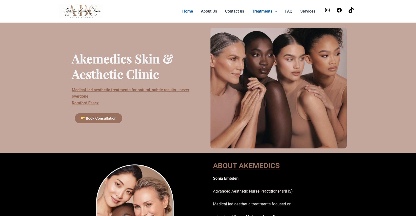
Best for: Nurse-led UK clinics that need compliant treatment pages and integrated third-party booking.
AkeMedics Beauty runs a clear services menu, embeds Google reviews directly onto the site, and routes booking through an external portal built on Aesthetic Nurse Software.
- Google reviews embedded (not just linked) for third-party credibility
- Clear clinic address and operating hours displayed prominently
- Treatment descriptions written with UK compliance considerations
- Explicit booking link to the Aesthetic Nurse Software portal
Booking stack: Aesthetic Nurse Software portal.
Copy this: The combination of embedded third-party reviews (which feel more credible than hand-picked testimonials) with an external booking link patients can verify independently.
Tradeoffs: External booking portals create a small friction point when patients leave the main site. Adding “you’re booking directly with our clinic” messaging around the link reduces hesitation. The site would also benefit from more detailed practitioner bios to strengthen the trust stack.
Compliance note: UK clinics should follow ASA guidance on Botox advertising, using “anti-wrinkle injections” or “consultation” framing rather than promotional POM claims.
This site was built by DevMart.
3. SkinSpirit
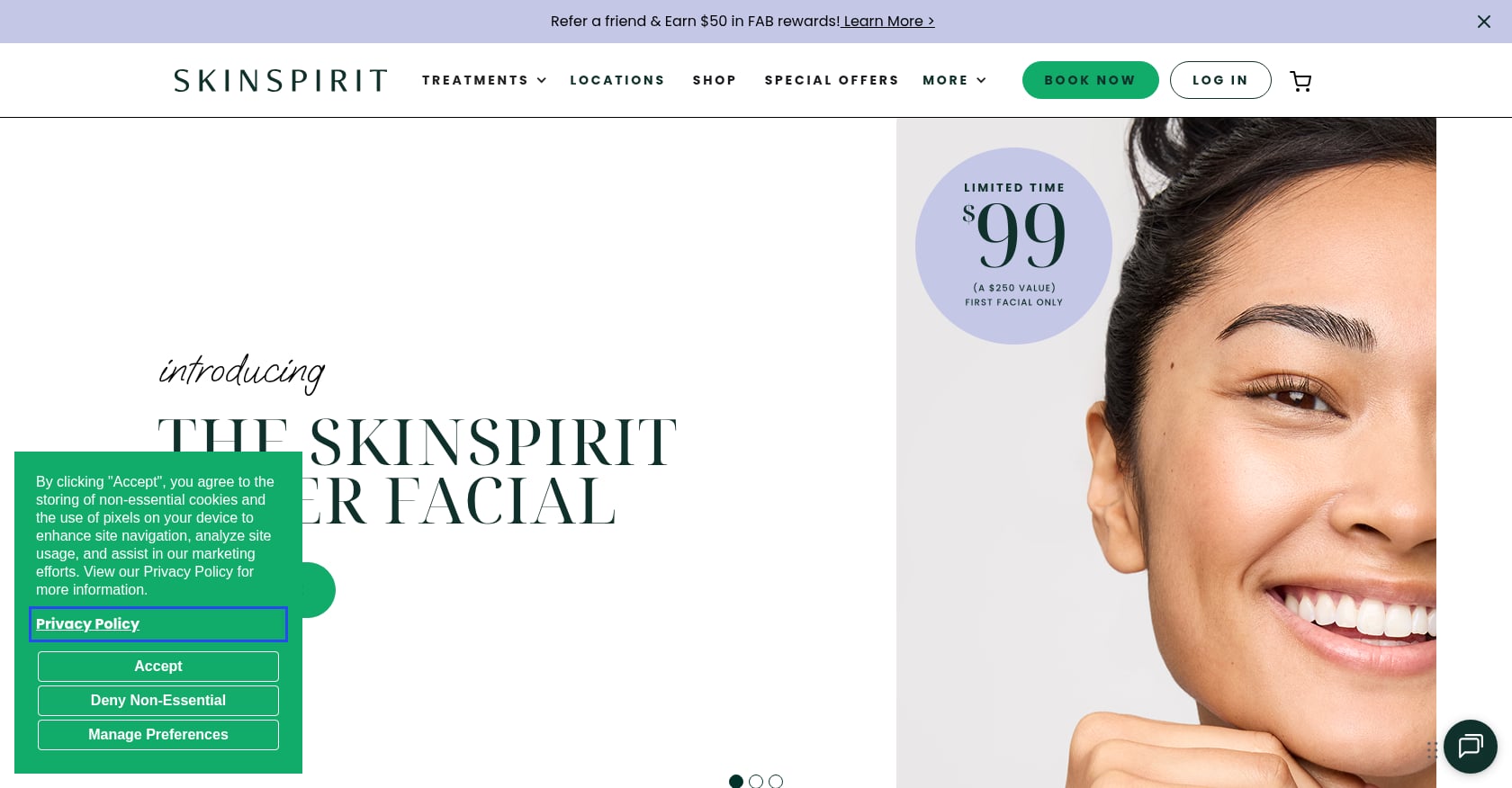
Best for: Multi-location medspas integrating retail products alongside treatment bookings.
SkinSpirit operates 50+ US locations and balances a huge service catalog with a location-first booking flow. The homepage funnels visitors to “find a clinic,” then routes them through treatment selection alongside integrated e-commerce for skincare products.
- Location finder is the primary navigation element
- E-commerce for retail products sits alongside treatment booking
- Multi-step booking flow stays clear despite a massive catalog
- Strong brand consistency across all location pages
Booking stack: Proprietary enterprise system at booking.skinspirit.com.
Copy this: The “find your clinic first, then browse treatments” flow. It prevents overwhelm and personalizes the experience by location.
Tradeoffs: Content-heavy pages can slow load times significantly. With 50+ locations, keeping LCP fast across every page demands active optimization. A mobile-first design approach is essential at this scale. The proprietary booking system also means high development costs that aren’t realistic for smaller practices.
4. Upkeep Med Spa
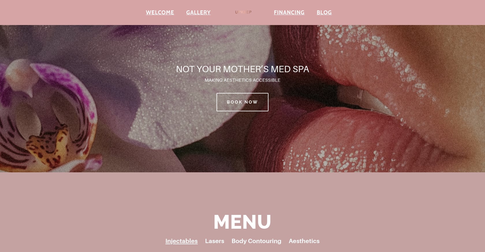
Best for: Clinics that want to lead with price transparency and a polished checkout experience.
Upkeep Med Spa in NYC and Dallas puts prices front and center. Treatment pages display clear pricing, and the “Book” button links directly to Boulevard checkout endpoints.
- Visible treatment pricing (not hidden behind “call for details”)
- Slogan-led positioning that communicates value within seconds
- Booking links resolve to Boulevard’s joinblvd.com domain
- Clean, modern design with consistent visual identity
Booking stack: Boulevard (identifiable via joinblvd.com/dashboard.boulevard.io in booking URLs).
Copy this: Price transparency as a conversion tactic. When patients see costs before booking, they arrive at consultations pre-qualified and more ready to commit.
Tradeoffs: Boulevard pricing is quote-based and positions toward the premium end of booking platforms. It’s excellent for luxury or mid-to-high-end practices but may be overkill for a solo practitioner who just needs a scheduling link. Also, the flat pricing display works best for standardized treatments; it gets complicated for custom treatment plans.
5. Dr David Jack Clinics
Best for: Luxury UK clinics layering press mentions, certifications, and rich educational content.
Dr David Jack Clinics in London stacks trust signals throughout the site: press quotes from major publications, B-Corp certification, detailed practitioner bios with qualifications, and before/after galleries.
- Deep content: blog posts, treatment guides, aftercare information
- Practitioner bios with qualifications and professional headshots
- Gift card purchasing through Pabau integration
- Press mentions and certification badges above the fold
Booking stack: Pabau (visible through partner links and gift card functionality).
Copy this: The “trust stack” approach. Combining press mentions, certifications, and detailed bios creates a level of authority that a single review widget can’t replicate.
Tradeoffs: This depth of content requires ongoing investment. If your team can’t regularly update the blog and refresh before/after galleries, the site starts to feel stale. Pabau’s pricing is also quote-based, which means you’ll need to evaluate costs during a demo rather than checking a pricing page.
6. JECT
Best for: Brand-forward injectable practices built around membership and account-based loyalty.
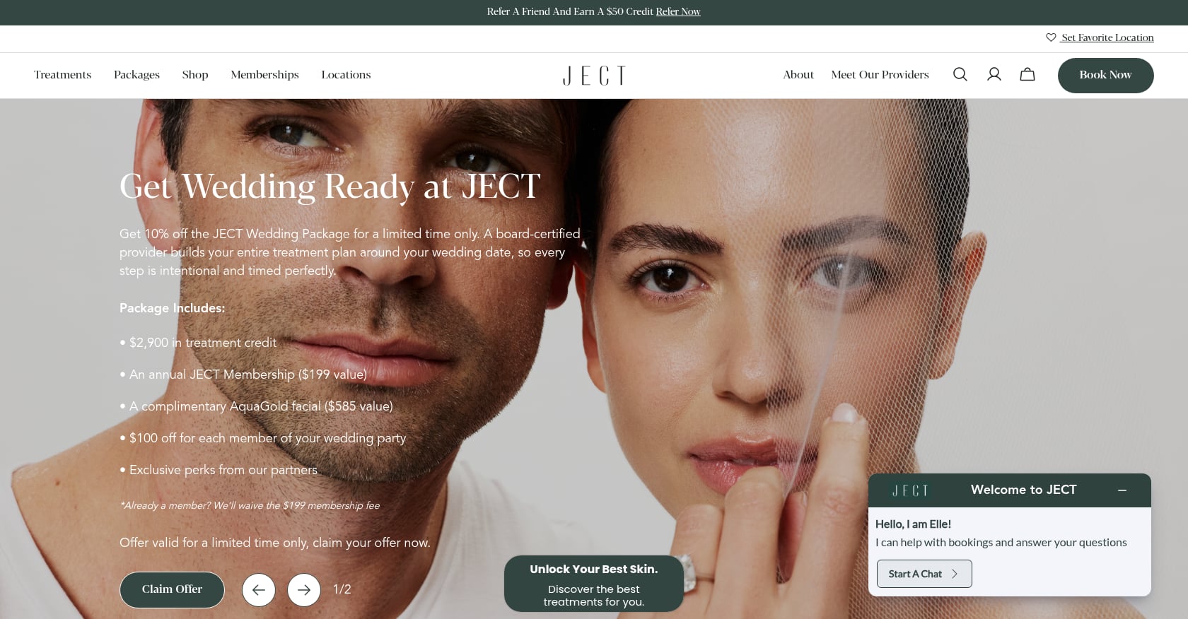
JECT operates in NYC, LA, and Miami with a brand identity that feels more like a wellness brand than a clinical office. Membership perks are promoted on the homepage, and the booking flow encourages account creation, feeding the loyalty loop.
- Membership portal with member-only CTAs and pricing
- Cohesive brand voice across every single page
- Clean navigation prioritizing booking and membership signup
- Premium visual design supporting higher price expectations
Booking stack: Enterprise webstore at booking.ject.us.
Copy this: The membership-as-CTA model. Instead of just “Book Now,” the site offers “Become a Member” as an upsell path that increases lifetime value from the first interaction.
Tradeoffs: Account-based booking adds a step for first-time patients who just want a quick appointment. The membership push can feel aggressive to someone who hasn’t had a consultation yet. Consider offering a simple booking path for new patients and saving the membership pitch for after the first visit.
7. Sisu Clinic
Best for: Clinics that want to build their brand around flat, upfront pricing.
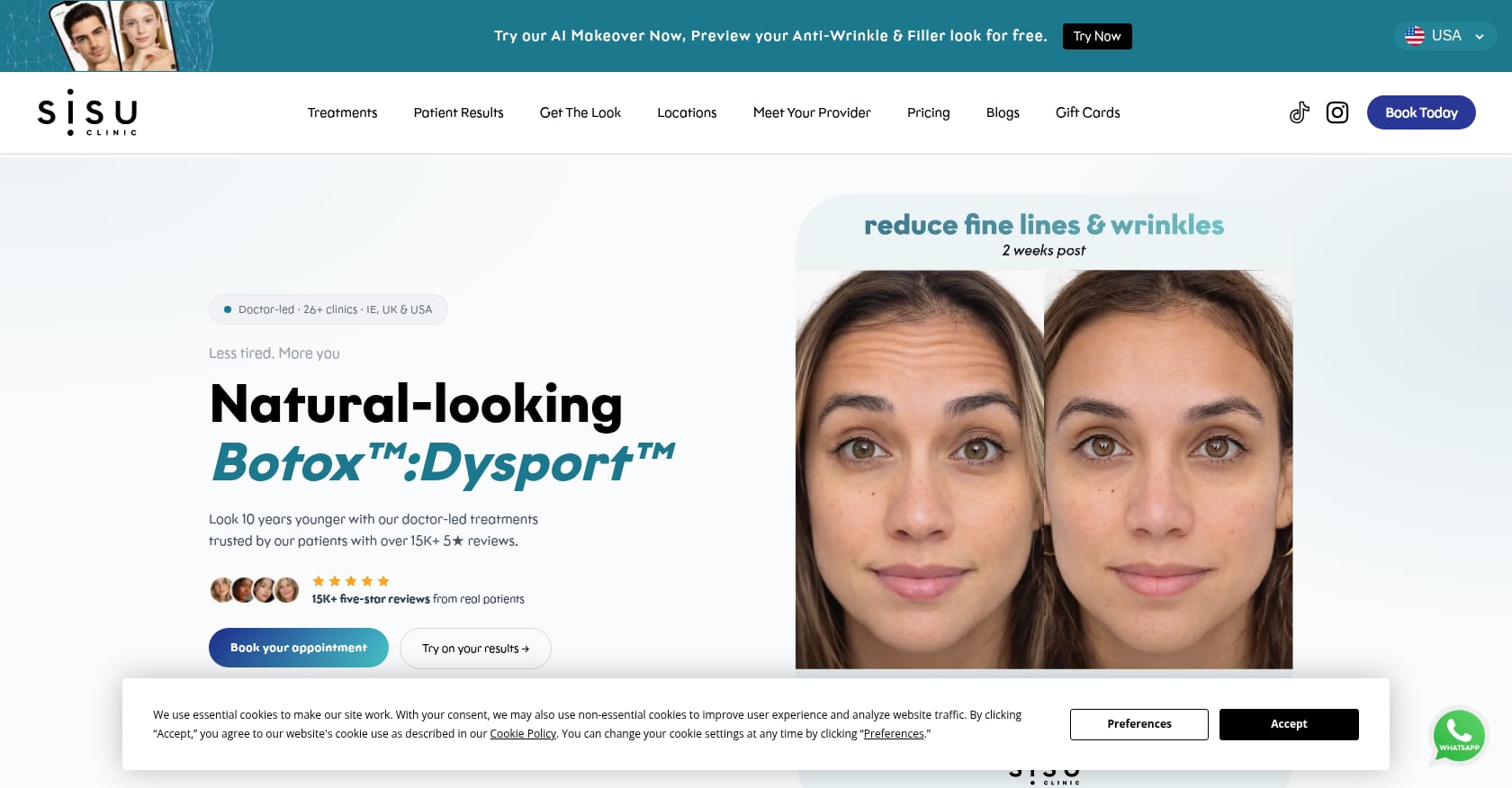
Sisu Clinic operates in the US, Ireland, and the UK. The standout feature is “one flat price, no add-ons” messaging that directly addresses the pricing anxiety patients feel.
- Pricing page shows exact costs per treatment
- Doctor-founded positioning reinforced throughout copy
- Chat integration for quick pre-booking questions
- App-based booking for repeat patients
Booking stack: Custom app at app.us.sisuclinic.com, running on the Phorest ecosystem.
Copy this: “Flat price, no surprises” messaging (where legally permissible). It targets the number-one anxiety patients have about aesthetic treatments: unexpected costs.
Tradeoffs: Flat pricing only works for standardized treatments. If your practice does custom plans with variable dosing, you’ll need “starting from” language instead. Practitioners on Reddit frequently note that patients notice when online pricing doesn’t match what they’re charged in person. Whatever you publish, make sure it’s accurate.
8. City Skin Clinic
Best for: Virtual and tele-dermatology practices offering dual booking paths.
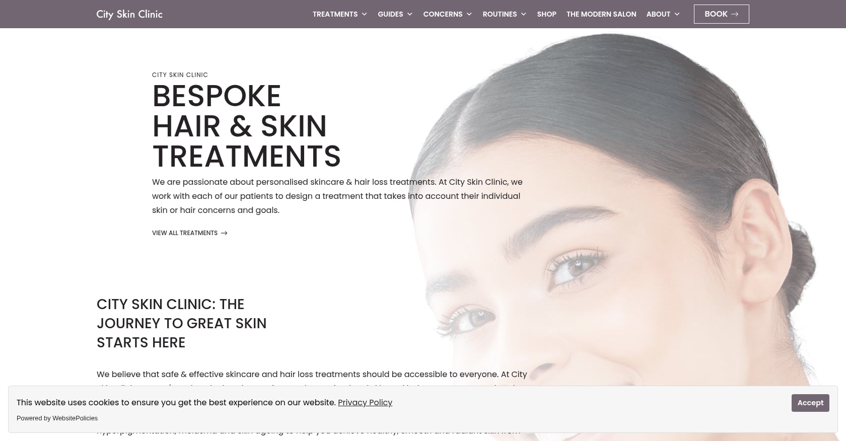
City Skin Clinic in the UK runs an online consultation-first model. Patients choose between submitting a photo-based form (asynchronous) or booking a live video consultation.
- Two clear booking options accommodate different patient preferences
- Visible pricing and turnaround times for each consultation type
- Minimal, clinical design that communicates professionalism
- Consultation-first language that aligns with UK compliance
Booking stack: Custom integration (form-based and video scheduling).
Copy this: The “choose your path” booking model. Some patients want a quick form submission; others need face-to-face video. Offering both widens your capture.
Tradeoffs: Managing two intake paths requires more backend coordination. A small team might struggle to keep response times fast on both. Start with one path, validate it, then add the second once your workflow can handle it. The virtual-only model also lacks the in-person trust signals (clinic photos, location tours) that help convert patients researching physical clinics.
These clinic website examples show what’s possible when you design around patient behavior instead of aesthetic trends. If your own site gets traffic but not bookings, the fix is usually structural, not visual. Start with these five practical ways to convert website visitors into paying clients and measure the difference.
9. SEV Laser

Best for: Chains combining clear service navigation with app-based loyalty programs.
SEV Laser pairs a large service catalog with a dedicated mobile app for booking, rewards, and account management. Service pages feature prominent “what to expect” sections.
- Service pages include “what to expect” educational content
- Pricing displayed prominently for core services
- App download promoted throughout the site for repeat bookings
- Clear service categorization despite a large treatment catalog
Booking stack: In-house ecosystem (website + mobile app).
Copy this: “What to expect” content on every service page. It answers the questions patients are Googling, reduces pre-visit anxiety, and cuts no-shows.
Tradeoffs: Reddit threads about chain medspa models consistently emphasize transparent deposit and cancellation terms. When patients feel surprised by hidden costs or locked into packages, they share it publicly. Building a loyalty app also requires meaningful ongoing investment in development and maintenance.
10. LaserAway
Best for: High-volume national chains that need decision-tree booking to route patients efficiently.
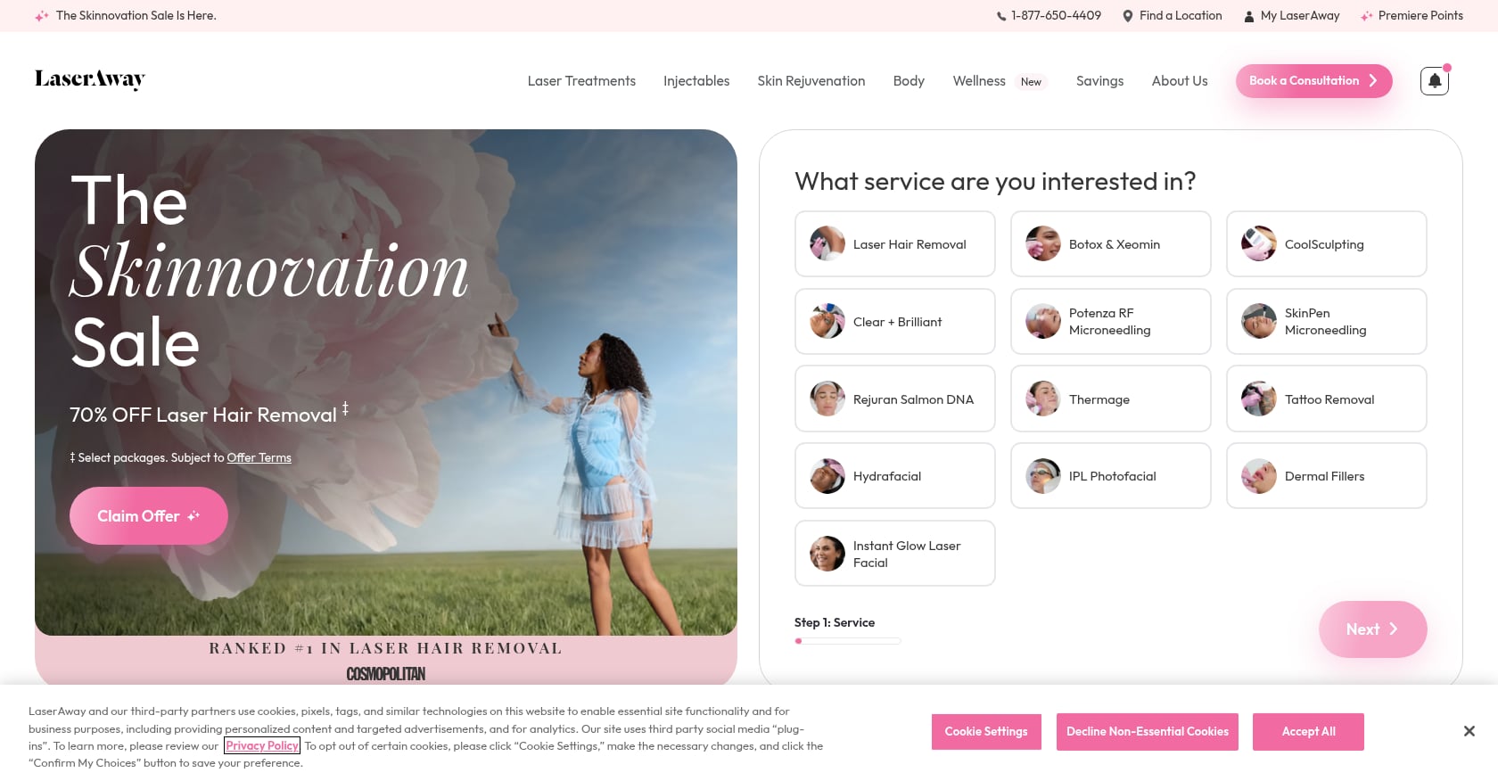
LaserAway’s booking flow asks patients to select their service interest, body area, and goals before showing available appointments. This pre-qualification reduces back-and-forth and ensures patients land with the right provider.
- Decision-tree booking walks patients through selections step by step
- National footprint with location-specific pages
- Large service catalog organized by treatment category and body area
- Clear visual hierarchy in the booking flow
Booking stack: Custom enterprise flow.
Copy this: The decision-tree intake model. For practices with more than a handful of services, guiding patients through choices (instead of presenting a mega-menu) reduces overwhelm and drop-offs.
Tradeoffs: LaserAway receives significant community criticism about perceived hard-sell tactics and opaque refund policies. The lesson: publish financing options, refund terms, and no-show fees near the booking CTA, not buried in footer text. The enterprise booking system also isn’t replicable for smaller clinics without custom development.
11. Mabrie Facial Institute
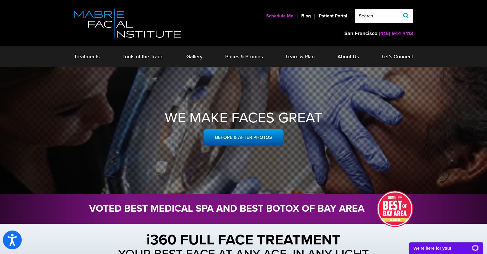
Best for: Doctor-led practices that use patient education as their primary conversion strategy.
Mabrie Facial Institute in San Francisco takes a “Full Face” approach with an interactive navigator that lets patients select their area of concern and explore relevant treatments.
- Interactive “choose your concern” tool on the homepage
- Deep educational content (videos, blogs, treatment guides)
- Strong doctor-led personal brand and authority
- Results library with detailed before/after documentation
Booking stack: Custom.
Copy this: The interactive concern navigator. It transforms passive browsing into active engagement and helps patients self-select toward the right treatment category before they ever call.
Tradeoffs: Heavy educational content needs ongoing production investment. If you stop publishing, the site becomes a time capsule. Community threads also suggest patients compare Mabrie with other local options, so pricing and policies should be easy to find alongside the educational material, not hidden behind it.
12. Juvly Aesthetics
Best for: Multi-state practices prioritizing policy transparency and consistent booking expectations.
Juvly Aesthetics stands out for its dedicated “Policies” section. Deposit requirements, cancellation terms, and what to bring to a first visit are all spelled out before anyone books.
- Dedicated policies page visible in the main navigation
- Brand consistency across multiple state locations
- Online self-scheduling integrated directly into the site
- Clean treatment pages with straightforward descriptions
Booking stack: Integrated online self-scheduling.
Copy this: A policies hub visible in the main nav. One LinkedIn practitioner observed that most medspas leak revenue after the click through slow or unclear follow-up, converting only 10 to 15% of inbound leads. Clear policies are part of closing that gap, as they reduce the back-and-forth that stalls the booking-to-visit pipeline.
Tradeoffs: Overly detailed policy pages can intimidate if not well-structured. Use collapsible sections or FAQ formatting rather than a wall of legal text. The site could also benefit from stronger visual trust signals (reviews, practitioner photos) above the fold.
13. Evolve Med Spa
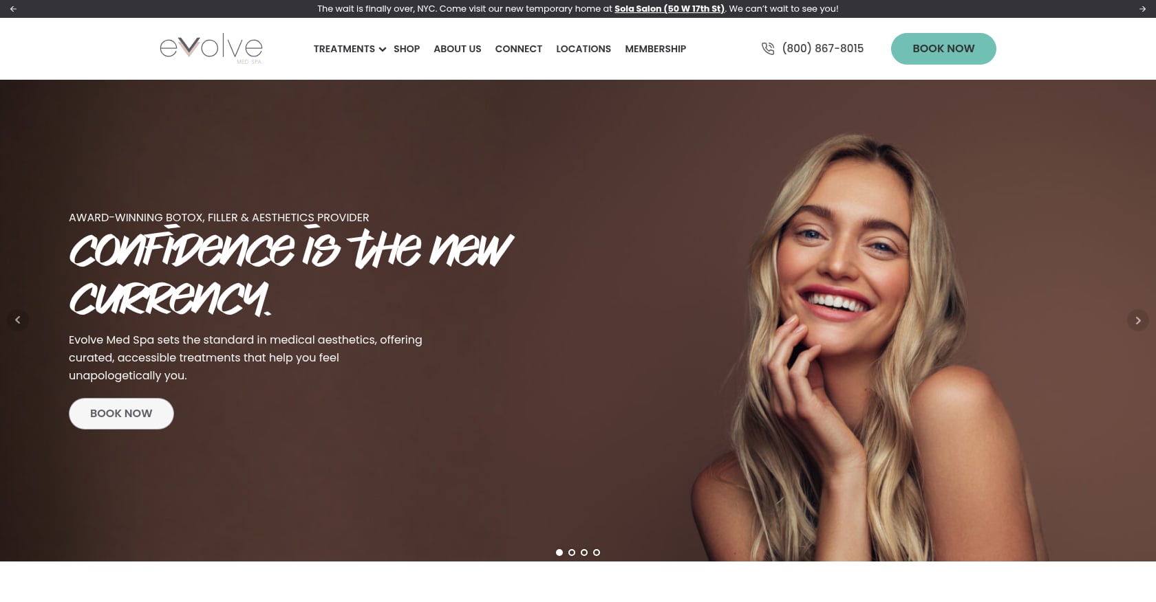
Best for: Practices that want an editorial, brand-story-driven approach to their clinic website.
Evolve Med Spa in NY and NJ pairs confident brand storytelling with clean treatment navigation. Location pages surface team photos and local reviews prominently.
- Brand story content on the homepage builds emotional connection
- Location pages lead with local team profiles
- Treatment navigation stays clean and scannable
- Consistent visual identity across all pages
Booking stack: Custom.
Copy this: Location pages that lead with the local team, not just a generic map pin. Patients booking aesthetic treatments want to know exactly who they’ll see. Pairing location-specific content with strong local SEO for each clinic location supports this by connecting Google Business Profile data with on-site information.
Tradeoffs: Brand storytelling requires skilled copywriting. Generic “we care about your confidence” language reads as filler. The editorial approach also needs regular content updates to avoid feeling abandoned. If your team can’t commit to that, a cleaner, more functional layout will serve you better.
14. Thérapie Clinic
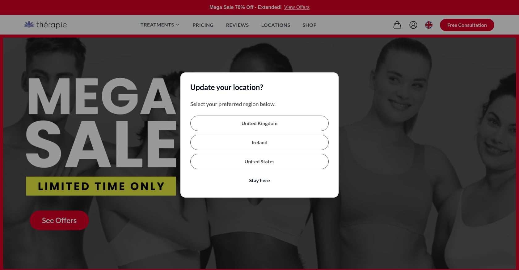
Best for: Large chains that want “free consultation” as the default low-commitment entry point.
Thérapie Clinic operates across Europe and the US. The default CTA everywhere is “Book a Free Consultation,” which lowers the commitment threshold for first-time patients evaluating multiple clinics.
- “Free consultation” is the primary CTA across the entire site
- Strong location finder for a multi-country operation
- Treatment pages organized by clear categories
- Consistent messaging across regions
Booking stack: Custom.
Copy this: Make “free consultation” the default CTA for first-time visitors. It reduces the perceived risk of engaging with your practice, especially for higher-ticket treatments where patients need reassurance before committing money.
Tradeoffs: “Free consultation” creates an expectation of no pressure. If the appointment turns into a hard sell, patients leave frustrated and share that experience online. The free model also attracts lower-intent leads who may not convert, so build a follow-up sequence that nurtures rather than pushes.
15. Contour Clinics
Best for: Australian multi-location clinics building an ecosystem of website, app, and loyalty rewards.
Contour Clinics in Australia promotes its dedicated mobile app alongside a website with location-specific FAQ sections and team profiles.
- Mobile app for booking, rewards, and account management
- Location pages with local FAQs and team details
- App download promoted throughout the site
- FAQ sections address location-specific questions (parking, hours, availability)
Booking stack: Custom app-based booking.
Copy this: FAQ sections on individual location pages. They answer location-specific questions that generic site-wide FAQs miss and also generate local search visibility through location-relevant content.
Tradeoffs: Building a custom app is expensive and only worthwhile once you have significant repeat booking volume. For most clinics, a mobile-optimized website with an embedded booking engine like Acuity or Boulevard covers 90% of the functionality at a fraction of the cost. App maintenance is also ongoing, so budget for it before committing.
16. Peachy Studio
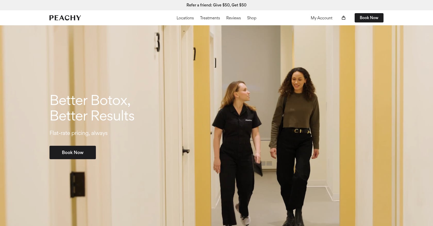
Best for: Injectables-focused practices scaling flat-rate pricing messaging across multiple cities.
Peachy Studio positions itself around “flat fee” pricing for injections across multiple US locations. The messaging is bold and simple: you know the price before you walk in.
- Flat-fee messaging dominates the homepage and all treatment pages
- Multi-city presence with location-specific landing pages
- Strong, modern brand identity
- Clear booking flow tied to specific locations
Booking stack: Custom.
Copy this: Clear, confident pricing language. If you can genuinely offer flat-rate pricing, say so prominently. It’s a powerful differentiator in a category where ambiguity drives patients to competitors.
Tradeoffs: Community threads flag that the “flat fee” sometimes includes brand surcharges for specific products. If your flat fee has any exceptions, publish them clearly. Hidden add-ons undermine the exact trust that transparent pricing is supposed to build. Additionally, US practices using “flat-rate Botox” messaging should note this framing is not permissible for UK clinics due to POM advertising restrictions.
UK Compliance: What the ASA and MHRA Require
Several of the clinic website examples above serve UK patients, and this section matters for any clinic owner building or redesigning a site for the British market.
Botox (botulinum toxin) is classified as a prescription-only medicine under MHRA rules. The ASA’s position is unambiguous: promotional advertising of Botox to the public is prohibited.
What this means in practice:
- No promotional “Botox” claims on homepages, landing pages, or paid ads
- Treatment pages should use “anti-wrinkle injections” or “injectable consultations”
- Before/after galleries should present balanced, factual information rather than promotional testimonials
- References to specific POM brand names should be informational only, presented within a consultation context
The best UK examples in this guide (Dr David Jack, City Skin Clinic, AkeMedics Beauty) handle this by centering CTAs around booking consultations rather than buying treatments. The language shifts from “Get Botox” to “Book a consultation to discuss anti-wrinkle options.”
Non-compliance risks ASA complaints, content takedowns, and reputational damage. Build compliance into the design from day one. The same principle applies to broader website accessibility and compliance standards: bake it into the foundation rather than patching it later.
How to Choose Your Booking Stack
The right booking engine depends on your clinic’s size, budget, and workflow. Here’s a quick guide based on what we observed across these examples.
Boulevard offers a polished patient-facing experience suited to multi-location or luxury practices. Upkeep Med Spa uses it for checkout, and the UX feels premium. Pricing is quote-based, so expect higher costs than simpler tools.
Pabau combines medical aesthetics EMR functionality with booking and is popular among premium UK clinics. Dr David Jack Clinics uses it for scheduling and gift cards. It’s strongest for practices that want patient records and appointment booking in a single platform.
Acuity (Squarespace Scheduling) is fast to embed and affordable for solo or boutique practices. Brilliance Aesthetics uses it with a simple as.me booking link. Squarespace publishes its scheduling tiers at accessible starting price points.
Phorest serves salons, spas, and medspas with built-in app capabilities. Sisu Clinic’s mobile app runs on the Phorest ecosystem. A strong option for practices that want an app without building one from scratch.
Aesthetic Nurse Software is built for UK nurse-led clinics with a dedicated booking portal. AkeMedics Beauty routes patients through this system.
Fresha charges no monthly fee for core booking features but takes a 20% commission on marketplace-sourced new clients. Worth considering for startups, but understand the commission math before committing. Those marketplace fees compound as your volume grows.
Whichever platform you choose, test the complete booking flow on a real phone over a mobile connection before going live. Practitioners on Reddit report that booking engines create the most friction when deposits, discounts, and membership pricing aren’t displayed consistently across the booking steps.
What Not to Copy
Not every pattern on these sites is worth replicating. Three things to avoid:
Hidden deposit and cancellation terms. Burying these until the final booking step generates complaints, no-shows, and negative reviews. Publish deposit requirements, cancellation windows, and rescheduling options near every booking CTA. Operators on Reddit’s small business forums consistently cite this as their top source of patient conflict.
Promotional POM language on UK sites. Even if a US competitor plasters “Botox” across their homepage, UK clinics cannot do this legally. Stick to consultation framing and balanced, factual treatment descriptions.
Autoplay video heroes that kill load times. Several of these sites use video backgrounds. Unless your hosting and CDN can deliver them without hurting LCP, a compressed static image is the safer choice. Slow pages don’t just frustrate visitors. They hurt rankings and conversion rates.
Build a Clinic Site That Books Patients
The best clinic website examples in this guide follow a formula: obvious booking, visible trust, clear pricing, fast performance. None of that requires a six-figure budget. It requires understanding what patients look for and building every page around their decision-making process.
Start with these questions about your own site:
- Can a new patient book within two clicks of landing on the homepage?
- Are practitioner credentials and reviews visible before the first scroll?
- Does the site load fast on a 4G mobile connection?
- If you serve UK patients, is your treatment language ASA-compliant?
Two of the sites in this guide (Brilliance Aesthetics and AkeMedics Beauty) were built by DevMart. If you’re planning a redesign or building from scratch, explore how conversion-optimized design changes results for clinics and apply the patterns from this guide to your own project.
Frequently Asked Questions
What makes a good clinic website in 2026?
A good clinic website puts booking within one or two clicks, loads fast on mobile, displays practitioner credentials and reviews above the fold, and uses compliant language for regulated treatments. Conversion mechanics matter more than visual trends. The best sites pair clean design with frictionless booking flows, transparent pricing, and trust signals patients actually notice and verify.
Which booking engine is best for a small aesthetic clinic?
Acuity (Squarespace Scheduling) offers the fastest setup and lowest cost for solo practitioners and small clinics. It embeds easily into most platforms and handles appointment types, intake forms, and automated reminders. Boulevard and Pabau are stronger for multi-location or mid-to-large practices needing deeper integration with patient records or retail.
Can UK clinics mention Botox on their website?
Only in a non-promotional, factual context. The ASA and MHRA classify Botox as a prescription-only medicine, so promotional advertising to the public is not permitted. UK clinic websites should use terms like “anti-wrinkle injections” and frame CTAs around consultations rather than purchases.
How important is mobile speed for a clinic website?
Critical. Most patients discover clinics on their phones. Google’s performance case studies document that slower Largest Contentful Paint directly correlates with lower conversion rates. Target an LCP under 2.5 seconds, compress hero images, skip autoplay video, and test your booking flow on a real phone before launching.
Should I show treatment prices on my clinic website?
In most cases, yes. Price transparency reduces bounce rates and pre-qualifies patients before consultations. If regulations or treatment variability prevent fixed pricing, use “starting from” ranges or clearly state that pricing is discussed during the consultation. The key is never leaving price as a complete mystery, because patients will assume silence means “expensive.”
What should every clinic treatment page include?
A clear description of the procedure, expected results and timeline, pricing or pricing guidance, practitioner information, before/after photos (with consent), treatment-specific FAQs, and a prominent booking CTA. Adding a “what to expect” section reduces pre-visit anxiety and no-show rates.
Do embedded reviews actually affect clinic bookings?
Yes. Third-party review embeds (Google, Trustpilot) carry more credibility than hand-picked testimonials because patients can verify them independently. Placing a review score or recent review snippets above the fold gives new visitors immediate social proof. This matters most for aesthetic treatments, where trust in a specific practitioner drives the booking decision.
How do I balance compliance with conversion on a UK clinic site?
Frame every CTA around consultations rather than treatments. Use “Book a consultation to discuss your options” instead of “Buy Botox.” Keep treatment descriptions factual and balanced. Include disclaimers where needed. The sites that do this well (like Dr David Jack Clinics and City Skin Clinic) demonstrate that compliance and high conversion rates are not in conflict. Clear, trustworthy language converts better than promotional hype.

