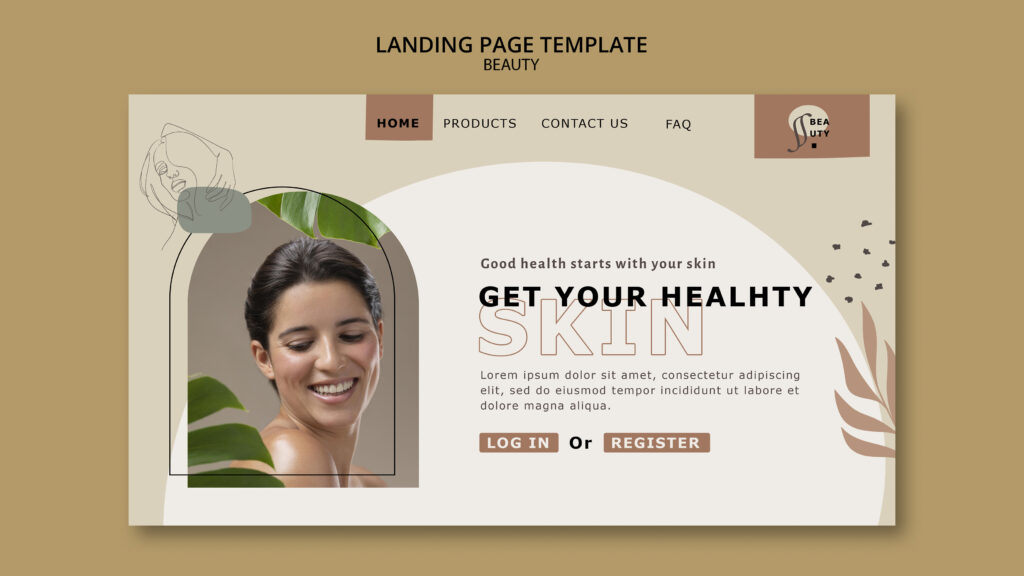
Introduction
In aesthetics, perception matters.
Patients judge your clinic long before they walk through the door.
And most of that judgement happens on your website.
A premium website does not mean flashy.
It does not mean expensive animations or bold colours.
True premium design feels calm, confident, and effortless.
This blog explains what makes an aesthetic clinic website feel premium — without looking overdone or artificial.
Why “Premium” Matters in Aesthetic Clinics
Aesthetic treatments are not impulse purchases.
Patients are careful.
They research.
They compare.
A premium website:
- Builds trust instantly
- Justifies higher treatment prices
- Attracts higher-value clients
If your website looks basic, patients assume your clinic is too.
Premium Does Not Mean Busy or Loud
One of the biggest mistakes clinics make is trying too hard.
They add:
- Too many colours
- Too many fonts
- Too many effects
This creates noise.
Premium design feels quiet.
It gives content room to breathe.
Less really is more.
Clean Layouts Create Confidence
A premium website is easy to scan.
It uses:
- Clear spacing
- Simple sections
- Logical flow
Visitors should never feel overwhelmed.
When navigation feels effortless, trust increases.
White Space Is Not Wasted Space
White space is powerful.
It:
- Makes content easier to read
- Highlights important elements
- Creates a luxury feel
Crowded pages feel cheap.
Spacious pages feel premium.
Colour Choices Set the Emotional Tone
Premium aesthetic websites use calm colours.
Common choices include:
- Soft neutrals
- Muted tones
- Gentle contrasts
Bright or harsh colours feel aggressive.
Soft palettes feel reassuring.
That matters in aesthetics.
Fonts Should Feel Professional, Not Trendy
Typography affects credibility.
Premium websites use:
- Clean fonts
- Easy-to-read text
- Consistent sizing
Avoid novelty fonts.
If text feels hard to read, users leave.
High-Quality Images Make a Huge Difference
Images speak louder than words.
Premium clinics use:
- Professional photography
- Real clinic images
- Natural lighting
Stock photos reduce trust.
Authenticity always feels more premium than perfection.
Subtle Animations Beat Flashy Effects
Motion can enhance design.
However, it should be subtle.
Examples include:
- Gentle fades
- Smooth scrolling
- Soft hover effects
Flashy animations feel dated fast.
Subtle movement feels modern and polished.
Clear Messaging Feels More Premium Than Clever Copy
Luxury is clarity.
Premium websites:
- Explain treatments simply
- Avoid buzzwords
- Speak calmly
Overly clever copy feels salesy.
Clear, confident messaging feels trustworthy.
Premium Websites Focus on Trust Early
Aesthetic patients need reassurance.
Premium websites highlight:
- Practitioner credentials
- Clinic experience
- Safety standards
This information should be easy to find.
Trust should never feel hidden.
Navigation Should Feel Effortless
Premium user experience is smooth.
Navigation should:
- Be simple
- Use clear labels
- Work perfectly on mobile
If users get lost, confidence drops.
Mobile Experience Defines Premium
Most users browse on mobile.
A premium website:
- Loads fast
- Scrolls smoothly
- Has clear buttons
Poor mobile design instantly damages perception.
Mobile-first is not optional.
Speed Is Part of the Premium Experience
Speed equals professionalism.
Slow websites feel unreliable.
Fast websites:
- Feel modern
- Reduce frustration
- Increase conversions
Premium clinics invest in performance.
Before-and-After Galleries Should Feel Elegant
Results matter.
However, presentation matters too.
Premium galleries:
- Are clean
- Use consistent lighting
- Avoid clutter
Poorly presented images reduce perceived quality.
Calls to Action Should Be Calm and Confident
Premium clinics do not shout.
CTAs should:
- Feel inviting
- Be clear
- Match the tone of the brand
Examples include:
- “Book a consultation”
- “Speak with our team”
Aggressive CTAs reduce trust.
Consistency Builds a Luxury Brand Feel
Premium design is consistent.
This includes:
- Colours
- Fonts
- Button styles
- Image tone
Inconsistency feels careless.
Consistency feels intentional.
Premium Does Not Mean Complicated
Simple websites often convert better.
Complex layouts:
- Confuse users
- Increase bounce rates
- Reduce enquiries
Premium experiences feel effortless.
Why Templates Often Fail to Feel Premium
Generic templates lack personality.
They:
- Look familiar
- Feel generic
- Blend in
Premium clinics need individuality.
Custom design always feels more exclusive.
The Role of Specialist Design in Premium Websites
Aesthetic websites are unique.
They require understanding of:
- Patient psychology
- Industry expectations
- Compliance standards
Generic designers often miss these details.
How Devmart Creates Premium Aesthetic Websites
At Devmart, premium means purposeful.
Our websites focus on:
- Clean design
- Calm messaging
- Fast performance
- Conversion-focused layouts
Everything serves a reason.
Nothing is overdone.
Final Thoughts
A premium aesthetic website does not shout luxury.
It shows it quietly.
Through:
- Calm design
- Clear messaging
- Smooth experience
When done right, your website feels trustworthy, professional, and confident.
And that is what premium patients look for.
Not perfection.
Just confidence done well.
check our recent case study — click here